The troubles with classifying
Ever since the production of typefaces underwent industrialization, there’s always been a stubbornness to incorporate all types available into a single classification. An initiative that has been abandoned due to the proliferation of designs that merge styles indiscriminately. The best-known classification –made by Maximilien Vox– has survived possibly thanks to its adoption by the Association Typographique Internationale (ATypI) in 1962 and the British Standard in 1967. In spite of this, said classification does not include contemporary designs.
This is not a subject that attracts the attention of designers in general, but classifications are a necessity if you want to understand a complexity, a mnemonic device to remember formal characteristics by name. When the first experimental fonts that trumped existing categories emerged in the nineties (there were some that did that before, only not massively), the reaction was to create new groups, albeit not in a good way. An example of this is Lewis Blackwell’s book 20th Century Type. Remix, from 1998, that introduces two groups to incorporate the fonts which are unclassifiable within the Vox model: one is ‘Contemporary’ and the other ‘BC. Beyond Classification’. Even though the attempt is appreciated what one can analyze about it is not very useful.
Also used, as a way of categorizing groups, are concepts that remit to the connotation transmitted by the stylistic shape of a letter, but this has always been a problem because shapes not always represent the same idea; they can be interpreted, reinterpreted or erroneously interpreted, ultimately, arbitrary. Examples of this are the collections obtained by keyword searches in Internet such as: Groovy, terror, modern, techno, psychedelic, retro, grunge and who knows what other terms.
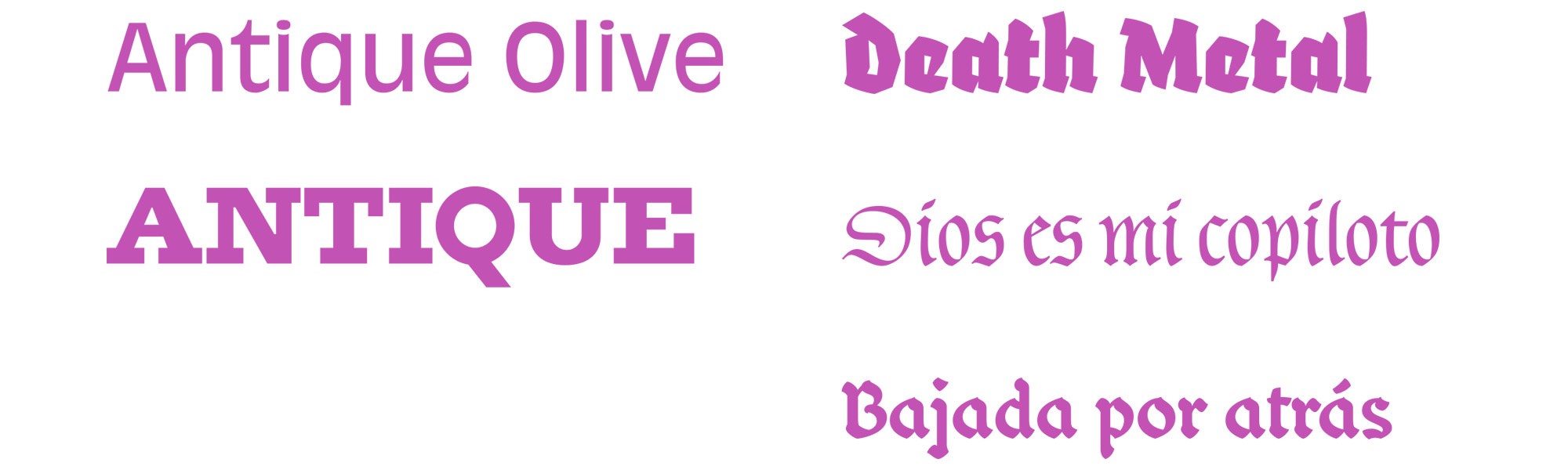
We are not dealing with a current issue. In the first classifications, such as Francis Thibaudeau’s (1921-1924), the word ‘Antique’ («old» in French) was employed to refer to the serif-less or linear shapes, which has spawned names that nowadays don’t make sense, such as Antique Olive (1962) by Roger Excoffon or in previous years to refer to quadrangular serifs as in Antique (1815) by the Figgins foundry. Could you imagine in entomology the use of criteria such as the degree of scariness that bugs have on people? Well, something similar happens when a bunch of designs are labeled with ideas. This is to communicate not to classify, besides stereotypes are generated that limit the graphic resources for the design of a message.
An idea that seems reasonable is that a classification must focus on defining a shape in order to pin it down, which is a trap because language has problems when attempting to accurately describe the particularities of letterforms. The task of assigning a meaning so that most people interpret it is an exercise in visual communication. A side issue that cannot be addressed in a couple of sentences, although many examples exist of how a same letter shape can represent different ideas. Such is the case of the gothic or blackletter. All of us Westeners have a more or less cliché idea of what a gothic letter is: mainly, that it is associated with the Middle Ages or that it is a type of letter that comes from Germany, but when its history is revised we find out that it was used in several places in Europe, especially in France. Despite of having appeared in the XII Century, nowadays there’s dozens of applications. We can see it in Death Metal bands, in lettering in trucks and rural buses of South America or in football supporters’ flags. Thus the shape of gothic letters does not intrinsically represent the Middle Ages or Germany, since its been resignified in different contexts.
This is why it is hard to classify by meaning.
Noordzij’s cube
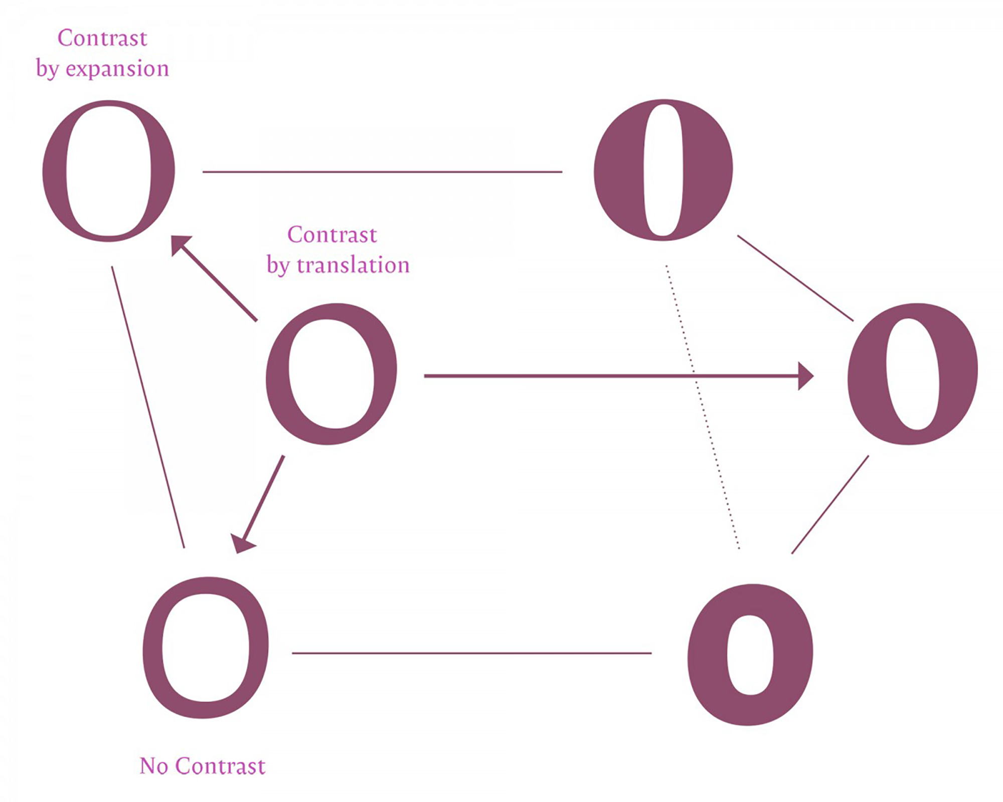
What is proposed here does not take into consideration anything new, it is not classifying in a strict sense but a way of covering or navigating the complexity of the style of letterforms. Perhaps in a simpler way and based, in part, in Gerrit Noordzij’s theory on the concept of contrast 1 (or the difference between the thin and thick parts of a same letter) generated by the manipulation of pens and pencils. In his book The Stroke. Theory of writing, Noordzij states (with his passionate and provoking point of view) an interesting theory about the shape of letters according to two main types of contrasts: one generated by the broad nib pen, named ‘contrast by translation’ and another that is obtained via the pressure of the flexible nib pen, designated ‘contrast by expansion’. A third kind, ‘contrast by rotation’, in which both previous types coexist, but let us keep things simple, let’s stay with these two ideas.
Even though the purpose of the type configuration presented here is not to replace said theory, it does seek to establish new questions. In this sense, the contribution of what is exposed in Noordzij’s book is essential to this proposal and is far from being complete.
Furthermore, we cannot forget the idea set forth by Alan Turing in 1952, regarding that every model is a simplification and an idealization and due to this fact it will always be a falsification. In spite of this models remain to be useful when they are internalized.
How to understand thousands of styles
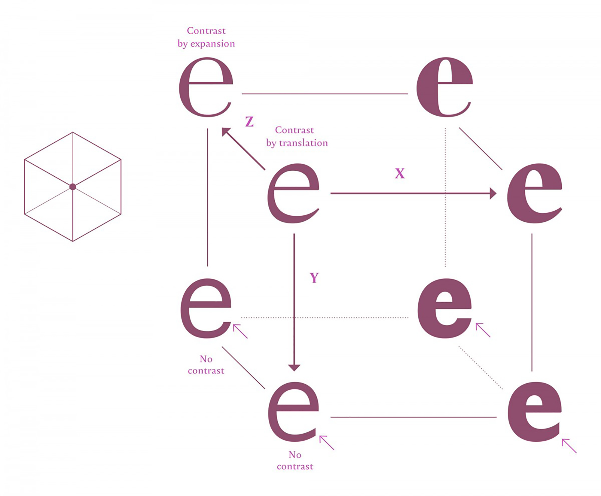
Firstly there are some concepts that need to be clear so that they allow us to navigate through Noordzij’s theory which is an important part of the arrangement proposed here and that I’ve named «The Typographic Vault». There are three formal phenomena in the thickness of letters (Y and Z axes) with their respective progressions in several steps or interpolation. There’s also an X axis, that comprises the increment of the stroke as it moves towards a more pronounced thickness.
However, some questions arise when wanting to apply it, like why is this interpolation model for the contrast of letters represented in a cube? What would happen if the letter were to be replaced by another, like an o? Would that figure resist as a way of representation? The original cube model does not contemplate thinner or Light weights; it only spans from a regular weight to a bold one. Under the perspective of the current market production, this segment of the progression is dearly missed.
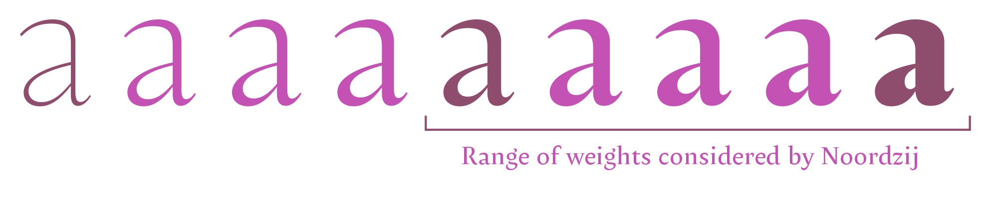
This omission is due to the calligraphic proportions of the traditional writings analyzed by Noordzij, since they were never done with thin strokes, but rather, regular and dark (humanist/chancery and gothic respectively). Both weights have been used for centuries for longer texts and some people, nowadays, erroneously decide to use thin letters for that. A thing that makes reading pretty uncomfortable.
Since weight remits to a same stylistic design, there’s no purpose in considering it within a sorting of different styles of shapes. Every style of letter may have more or less design problems and still be able to have a bolder and lighter version. The same ineffectiveness occurs when condensing and expanding proportions. Thus, the X axis plane would be eliminated from the Typographic Vault.
In the bottom part of Noordzij’s cube, one may notice that the letters ‘e’ with fewer contrast (regular or bold) have the only subtle difference in the angles in which its bottom parts are cut. A situation that is not as evident at first sight and that, furthermore, excludes several terminals that are produced in letters such as a, c, f, r on top and j, e, y, on the bottom, in certain styles. Therefore, it would be best to eliminate that duality and leave it only as a pole of uniform or monolinear thickness.
These observations would lead us to a different way of exploring and simplifying the representation of contrasts using a triangular based prism instead of a cube.
On the Z axis, on the other hand, you can appreciate that the interpolation of said axis is very subtle, so what’s the point in making an interpolation like that? Only exploratory purposes for the creation of new designs. That transition would be a hybrid between a broad nib pen and a flexible nib pen or brush, that is, from a contrast by translation to one of expansion. What Noordzij refers to as passing, historically, from classic to classicist (he surely means passing from a broad nib pen to a flexible nib pen) or, from an anthropological standpoint, transitioning from western to eastern (from the broad nib pen to the brush), a relation that is difficult to assert due to the fact that in the East the broad nib pen is also used in the writing of Devanagari. In spite of this, it does not cease to have an interesting symbolism.
Breaking down the ‘vault’ model
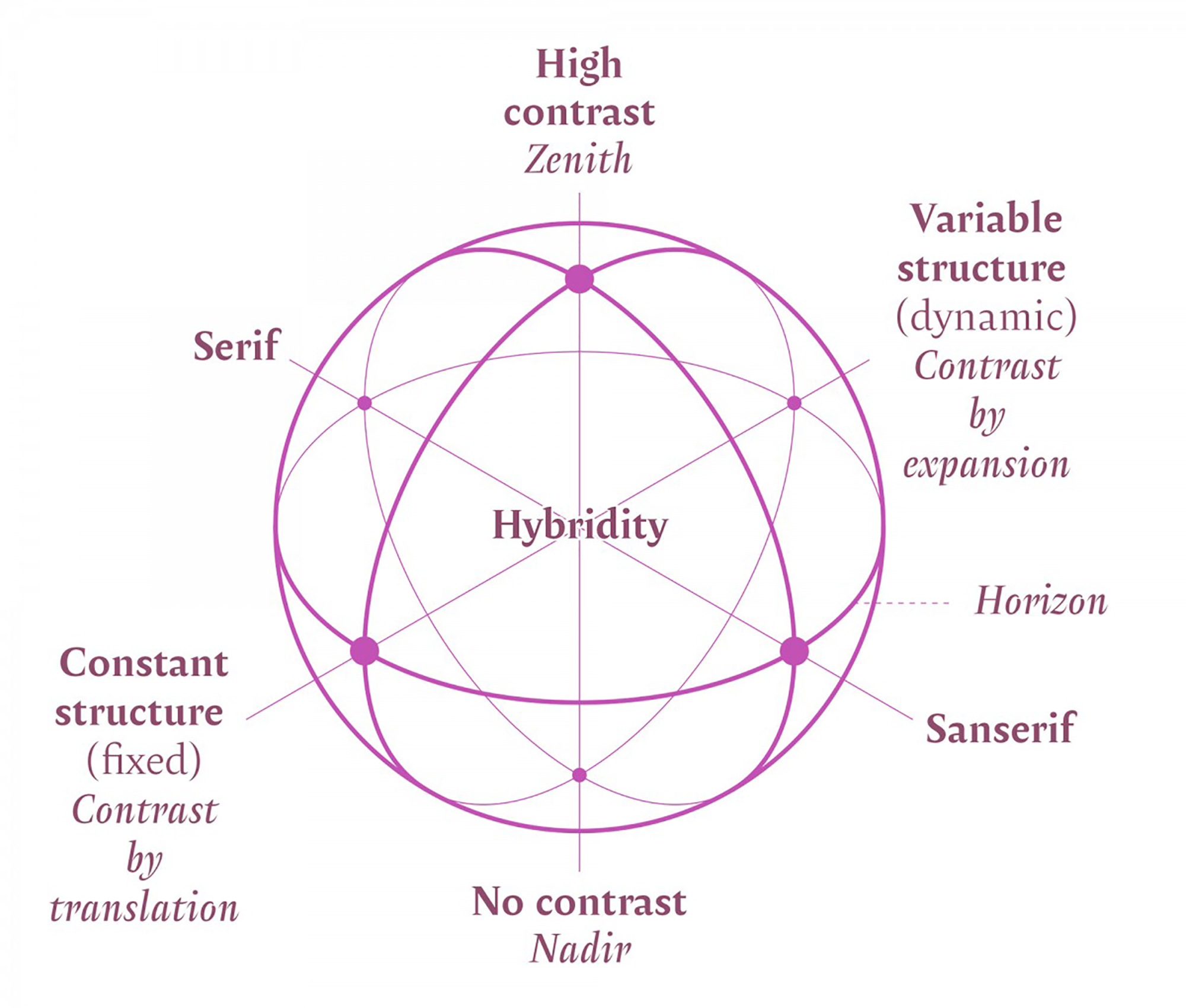
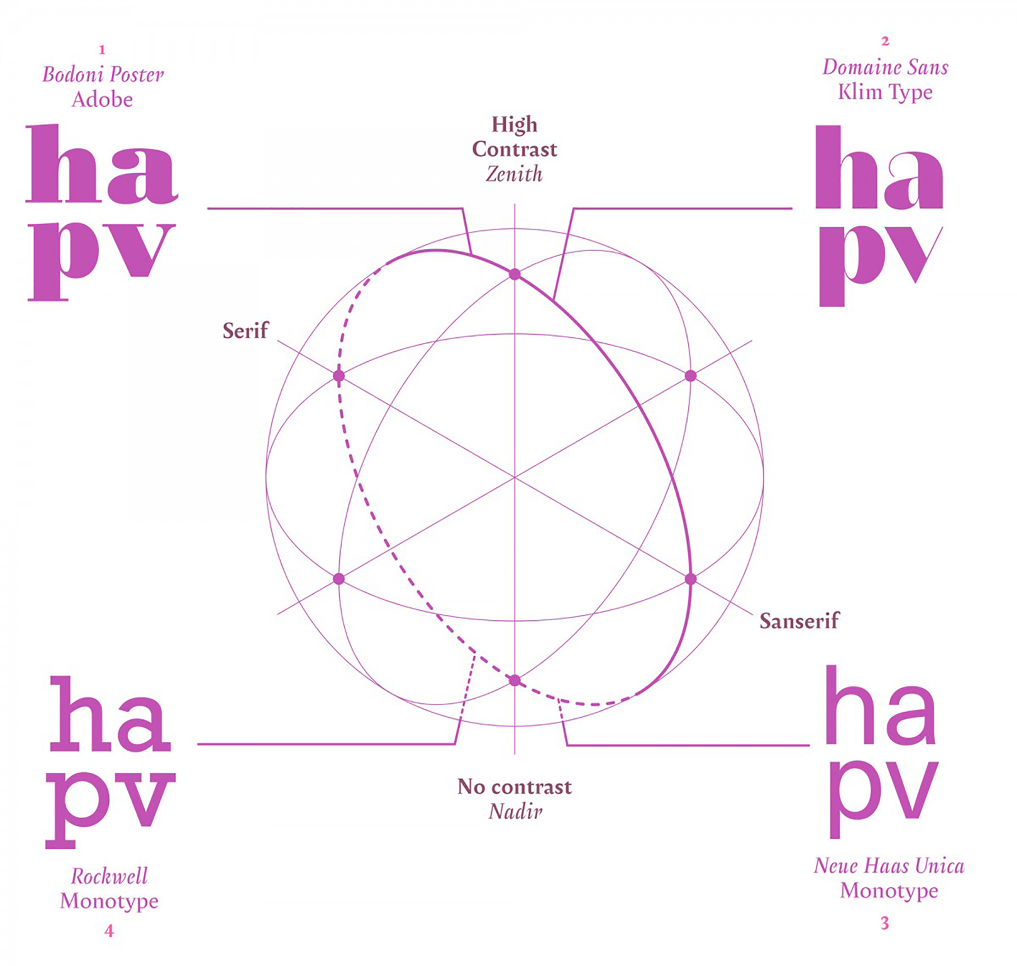
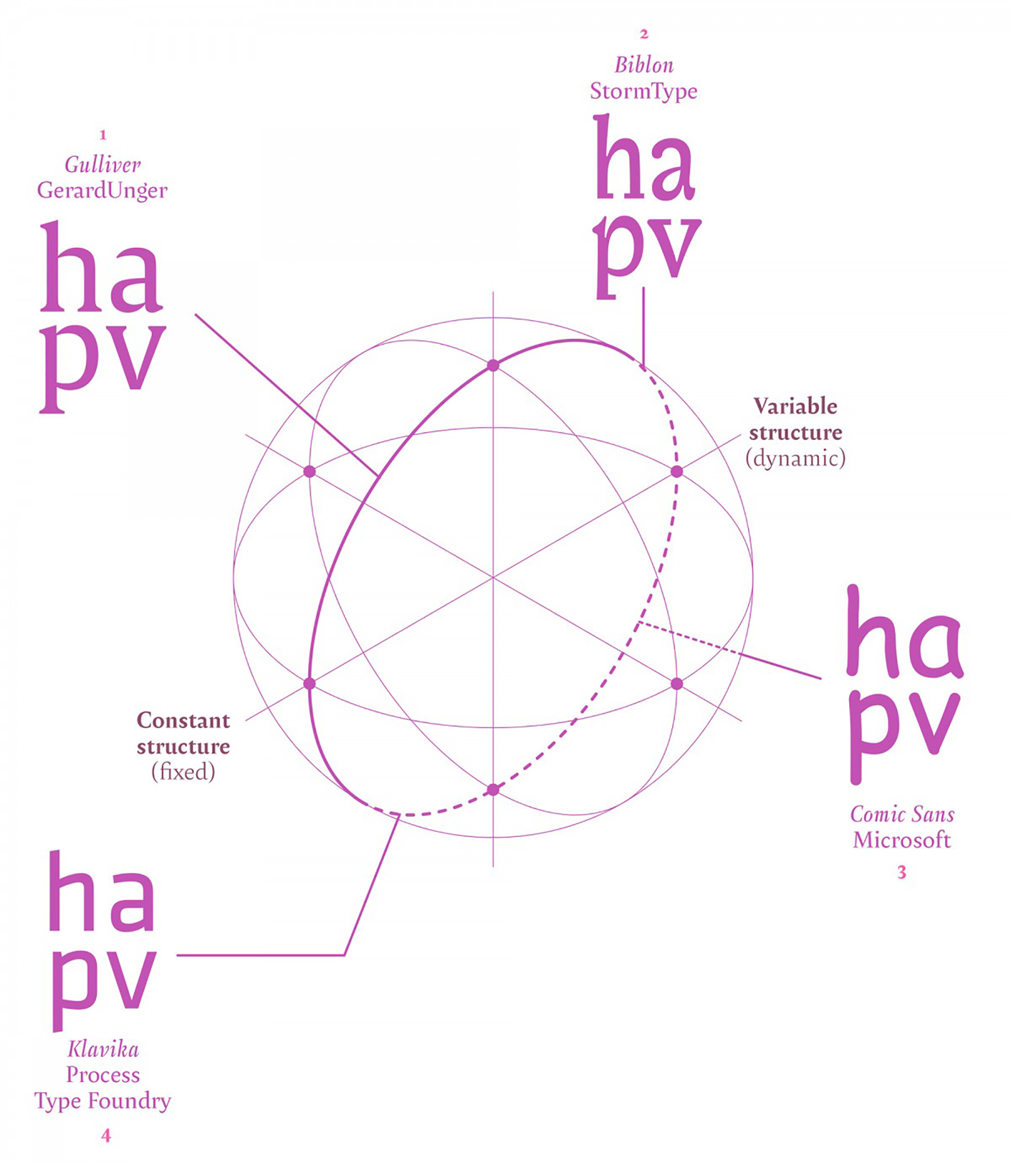
To make the Typographic Vault I had to revise and order these ideas and others that were hard to reconcile in a single model. Even though contrast by translation and expansion have a calligraphic origin, both can be susceptible of having arbitrary alterations or having a systematically rigid application, therefore cannot be considered as perfect models (perhaps here the contrast by rotation model would help, but that is specific to writing, not typography). Thus, it is much more reasonable to take contrast as a single category –pretty complex– and no contrast –much less complex– as poles of an interpolation. The interpolation between these extremes can be much more didactic and help us understand the multiplicity of designs, though not all of them of course. In spite of this, contrasts by translation and expansion are not excluded in this model.
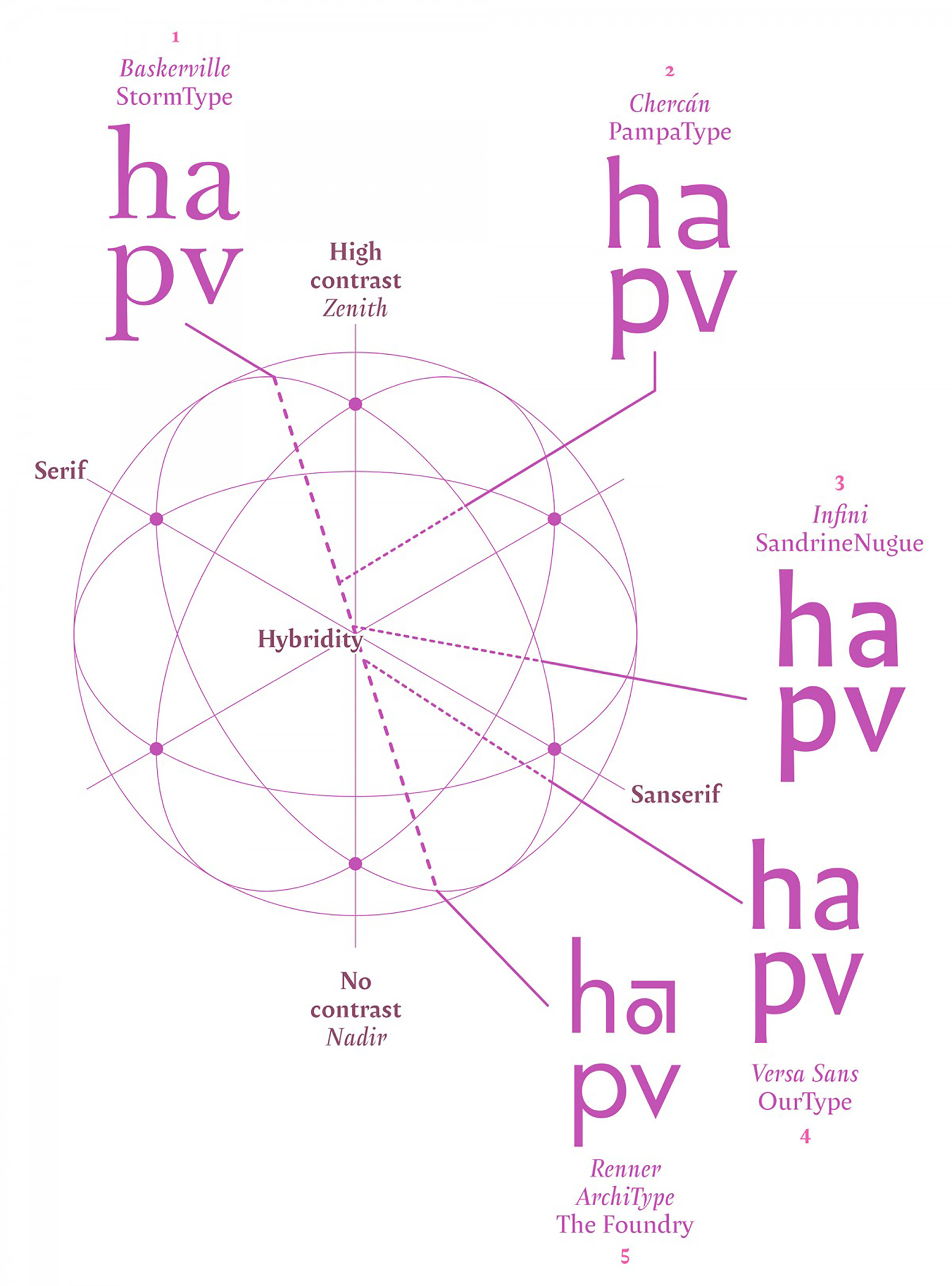
This idea of complexity is very useful especially for the hybridization and mixing of styles that current type designs have. I found, by accident, a text from the Belgian typographer Fernand Baudin, entitled “How Typography Works (and why it is important)” –ironically written by hand–, 2 in whose prologue, Charles Bigelow mentions the talks Baudin gave at Stanford University in reference to themes such as ‘Constellations of Typefaces and Configurations of Texts’. 3 Said concepts made sense to me and served to enrich the Typographic Vault, precisely via the constellation analogy which implies there’s a group of stars (typefaces in this case) that, by means of imaginary strokes, form a drawing that evokes a particular figure.
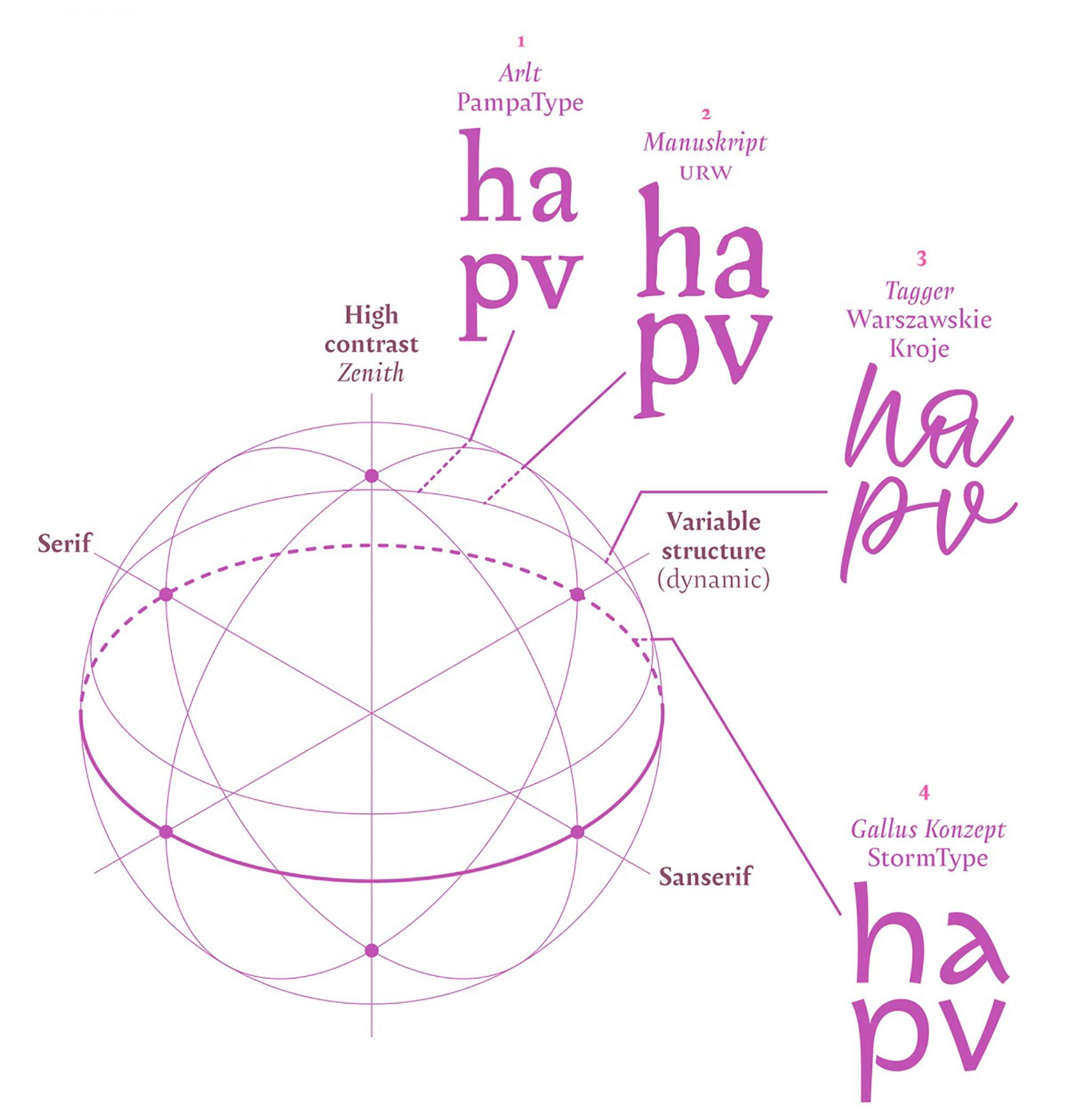
In this vein, the Vault would have that task: that of recognizing constellations which make it possible to read and navigate within drawings that represent types of contrasts, historical periods of styles, classifications and any design in general. It sounds ambitious, but in reality, the Vault is only the space where these relationships can be studied and therefore not a classification. We’ve set forth here the construction of a sphere that, as I see it, contains the essential categories that allow most crossovers to be made, if not all. The poles of the Vault would be the following: Serif and Sans, high contrast and low contrast, variable structure and constant structure. By having these six poles or nodes, we could incorporate any shape in a design, including Display typefaces.
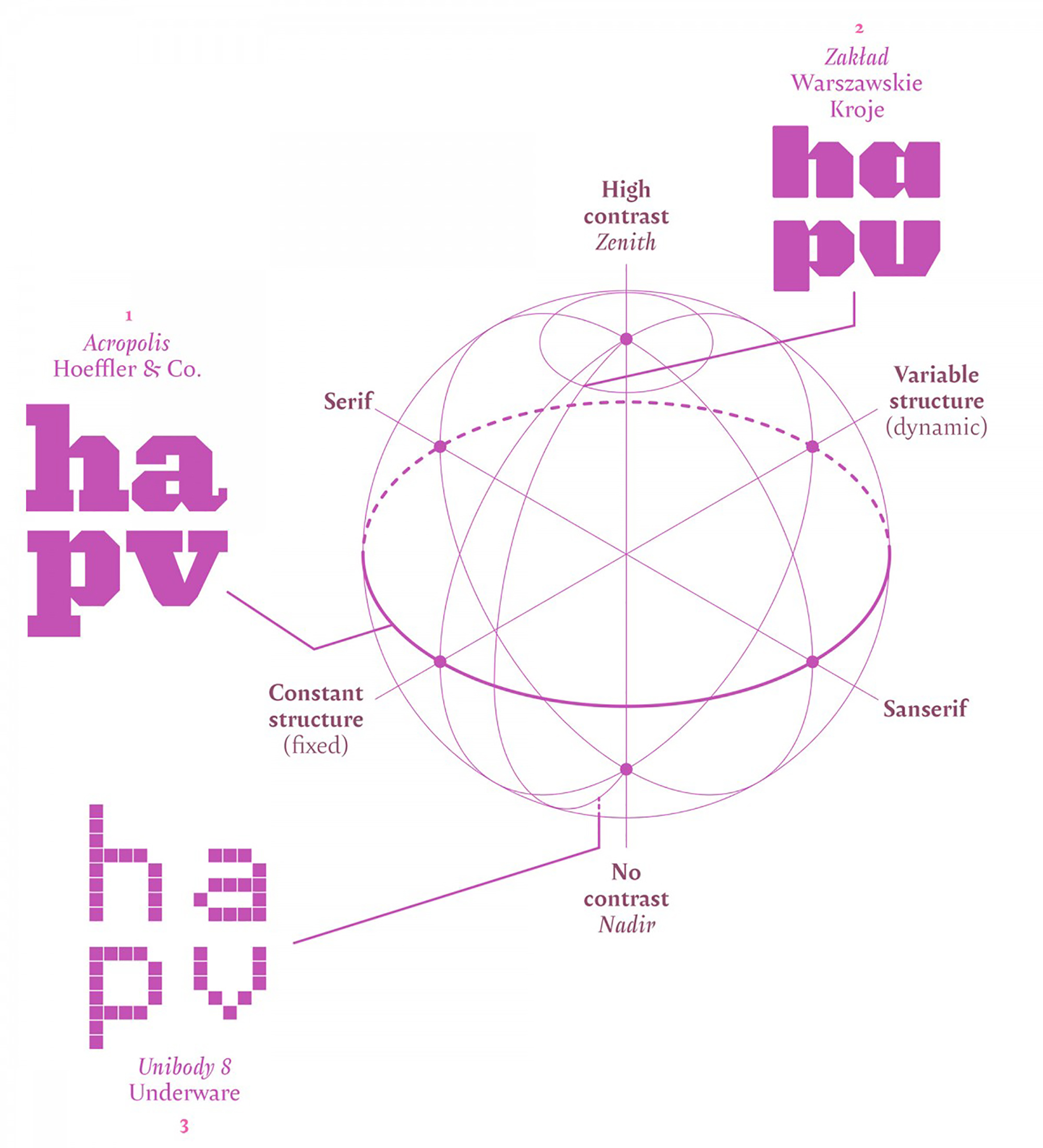
An invitation to complete
For an apprentice of typography or for someone who is starting to design typefaces, this vault could serve as a starting point to later understand historical classifications, which possess groups whose names do not necessarily represent the formal characteristics of the styles they differentiate. However, the Vault does not replace classifications, it only attempts to contain them. On the other hand, it provides a map to explore designs within parts of hemispheres that have few examples. The vault must not be understood as a final solution of all shapes but, rather, a space to complete.
So many fonts exist that it is, humanly speaking, impossible to include them all at once and of course be able to keep it updated. In this sense, someone that knows how to program could automatize a task so big. César Puertas, the Colombian type designer, has already made an attempt of parameterizing fonts with data and measurements obtained from the information that every type file has and even before that Benjamin Bauermeister made a sorting via the PANOSE system in 1985. However, some poles are hard to define with this data, as is the case with Constant structure and Variable structure.
All in all, this work, which began in the late nineties, has taken some time to mature in order to see the light of day, the uncertainty and variety of current designs has always been its stumbling block. There is still much to cover and discuss.
Francisco Gálvez Pizarro is a Chilean graphic designer and self-taught type designer. He teaches at the Pontificia Universidad Católica de Chile and is the author of the book Hacer y componer, una introducción a la tipografía, a broadly read title in the Spanish speaking world. His typeface Australis was awarded the Gold Medal at Morisawa, Tokyo, 2002. His typeface Otta was selected at the Modern Cyrillic, 2019. His typefaces Amster and Chercán are both Typographica favorites of 2014 and 2016. Together with Rodrigo Ramírez, Francisco created bespoke fonts for national newspapers, the public transport system and the motorway signs in Chile.
- Gerrit Noordzij is a Dutch designer that wrote a text in 1982 entitled The stroke of the pen: fundamental aspects of western writing in which he explains the constructive nature of the stroke. ↩
- This book was originally written in French: La Typographie au Tableau Noir (Typography on a blackboard), in 1984. ↩
- ‘Constellations of Typefaces and Configurations of Texts’, topic published in 1982 in an anthology about typography entitled De plomb d’encre, et de lumière by the Documentation Française. ↩