How to teach
How to teach type design is an issue that occupies me since 2008 at the Lorraine school of fine arts Metz. Different methods have been tested over the years, first in a class devoted to graphic design and typography, and then as a specific workshop. Although the starting points may differ, the purpose is common: the design of an alphabet intended for use on a computer, i.e. a font file with capital letters, lowercase letters, some punctuation marks and sometimes figures which that with the help of a keyboard allow the input of whole texts.
A wonderfully effective system, which I am constantly amazed.
Methods, approaches, issues
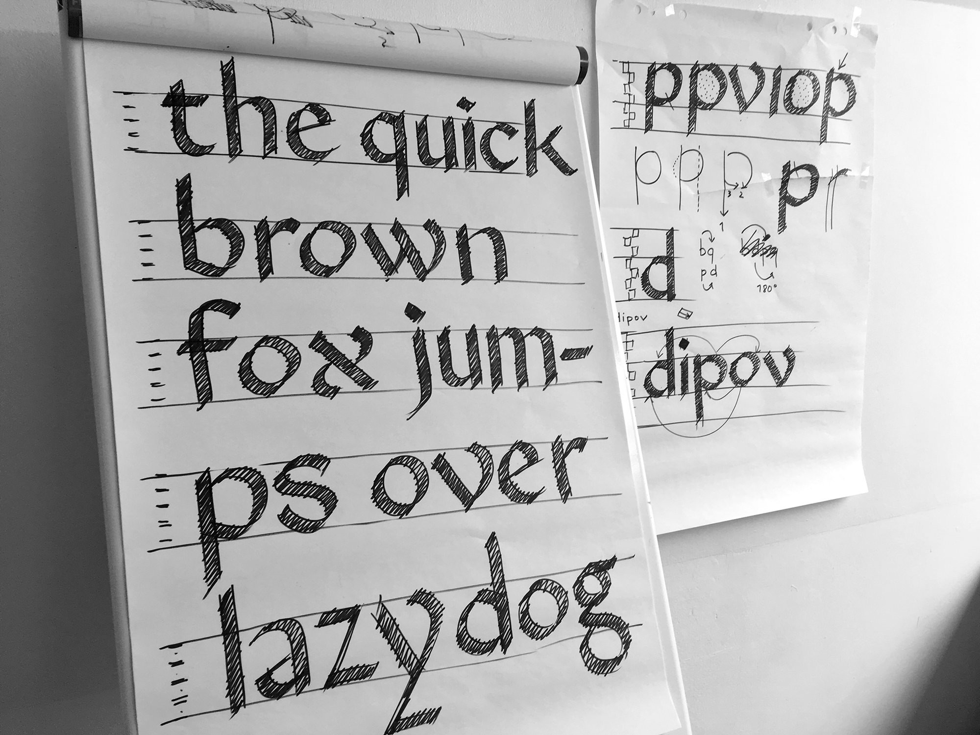
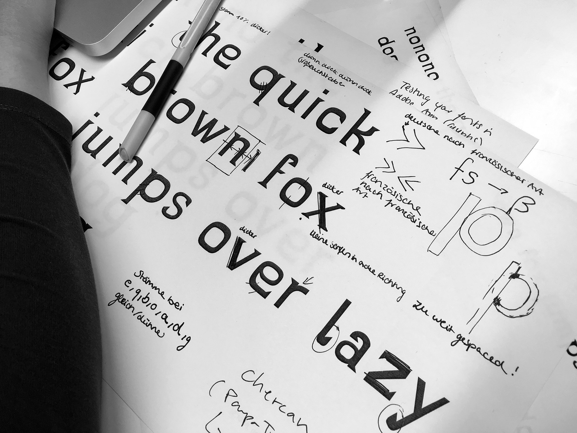
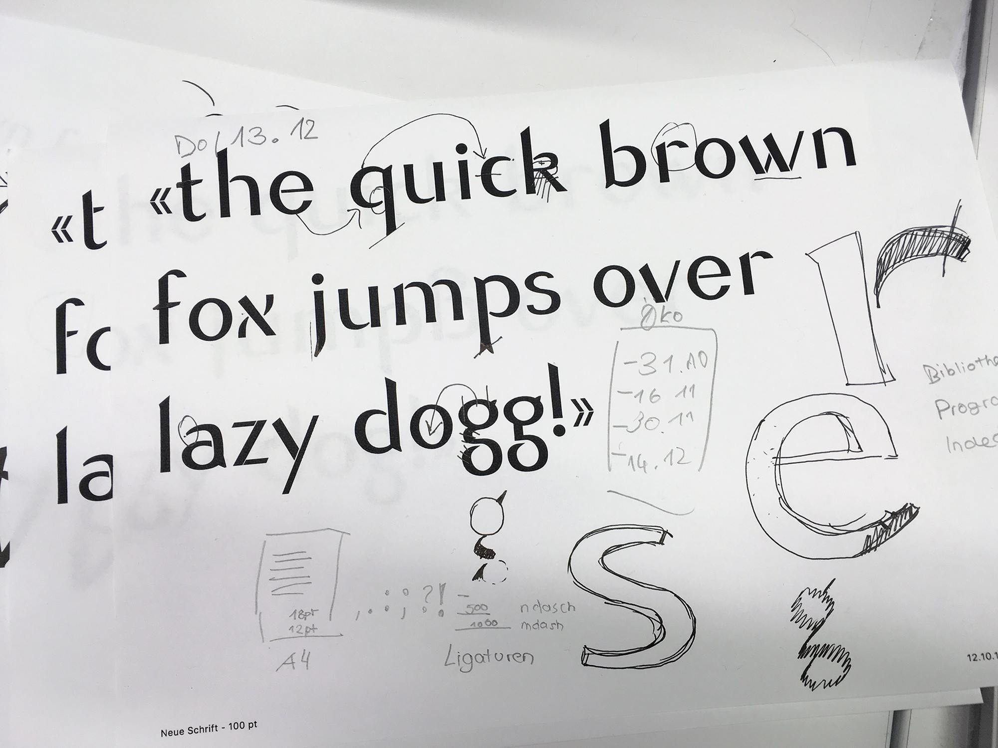
The method to achieve this is simple: draw a word consisting of a first letter in capital letters followed by lowercase letters. It is a question of defining the proportions, the modulation and the contrast with the help of some distinctive glyphs. This research on the identity of the character integrates reflections on its future context and is enriched by a referential search. It is only once this identity is defined that the student moves on to the digitization and the production of the font. What letters convey, their spirit, is paramount. Production and technical aspects are secondary, but developed.
Among the different starting points, we can distinguish between graphic approaches (seen characters) and typographic (rather read characters). It is the playful, modular approaches and the revivals of existing characters that have quickly given the most satisfactory results. Both guarantee consistency from the start, one using basic geometry, the other using a historical source.
Another, more unstable approach is to take calligraphy as a starting point. It requires much more time, but seems to me richer. In most cases, it is the humanistic hand that is proposed (as Johnston, Tschichold and Noordzij defined it in a simplified form, not far from typographic forms), but models based on a sharp pen or more historical (the Caroline, Uncial or Gothic styles) can also be starting points. The challenge is to emancipate from writing to go to type forms, while ensuring consistency between the letterforms of which calligraphy is a guarantor. This approach seems to me more alive and it can move towards many projects, as far apart as it may seem with for example geometric sanserif styles. I see fundamental distinctions to be made between the understanding of the written letterform (Writing, Calligraphy), drawn (Lettering) and typographic (Type). The challenge is to understand the relationship between writing and typography, and that typography is a ‹machine› which, since its beginnings, juxtaposes rectangular spaces where forms take place, forms that create lines, lines that create texts. And these texts can be embodied by innumerable voices and typographical intonations making the language visible, solid, to use the words of Bringhurst.
A special case
A special case in type design teaching is conducted in Metz with the Messine project 1 which aims to develop a typeface family for the needs of the school. The methods are similar but the project is distinguished by the additional dynamics brought by an external guest, the temporal inscription in the (very) long duration and by a group work. Since 2011, intensive workshops, about one a year, are conducted in partnership with Alejandro Lo Celso. Group work, inter-generational, requires a particular methodology to manage the hundreds of drawings of a growing family of characters, and that must be completed in order to be used in the school (administation, communication, signage, dissertations and student projects…). As part of the first workshop, we have for example created groups style, proportions, modulation, contrast, stroke endings, experimentation, corresponding to different details and key concepts to homogenize on the same drawing.
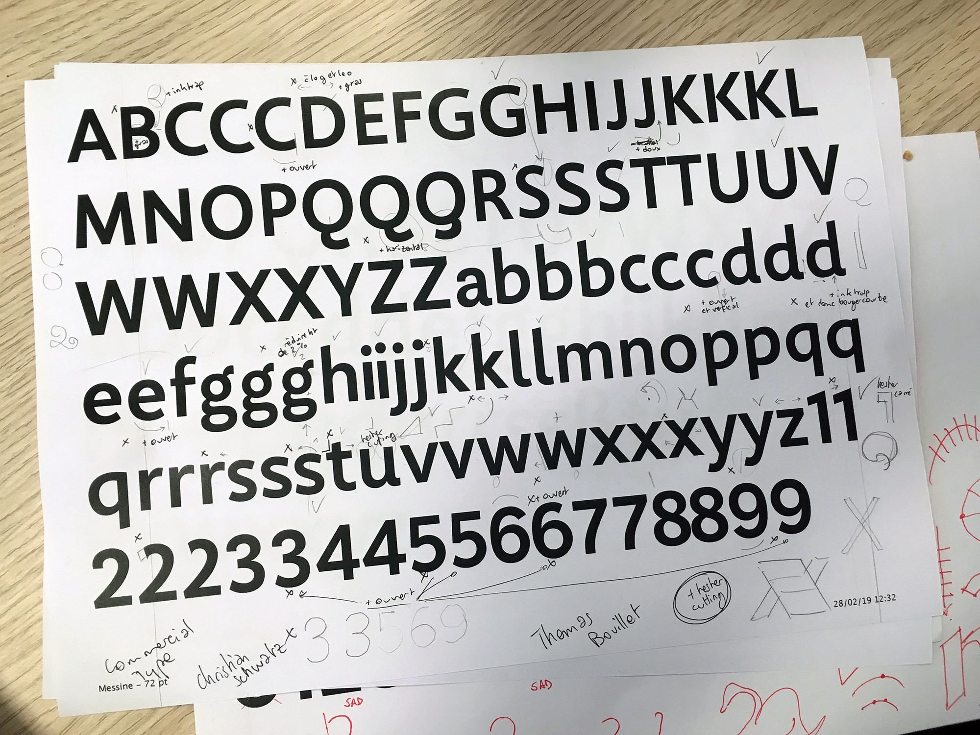
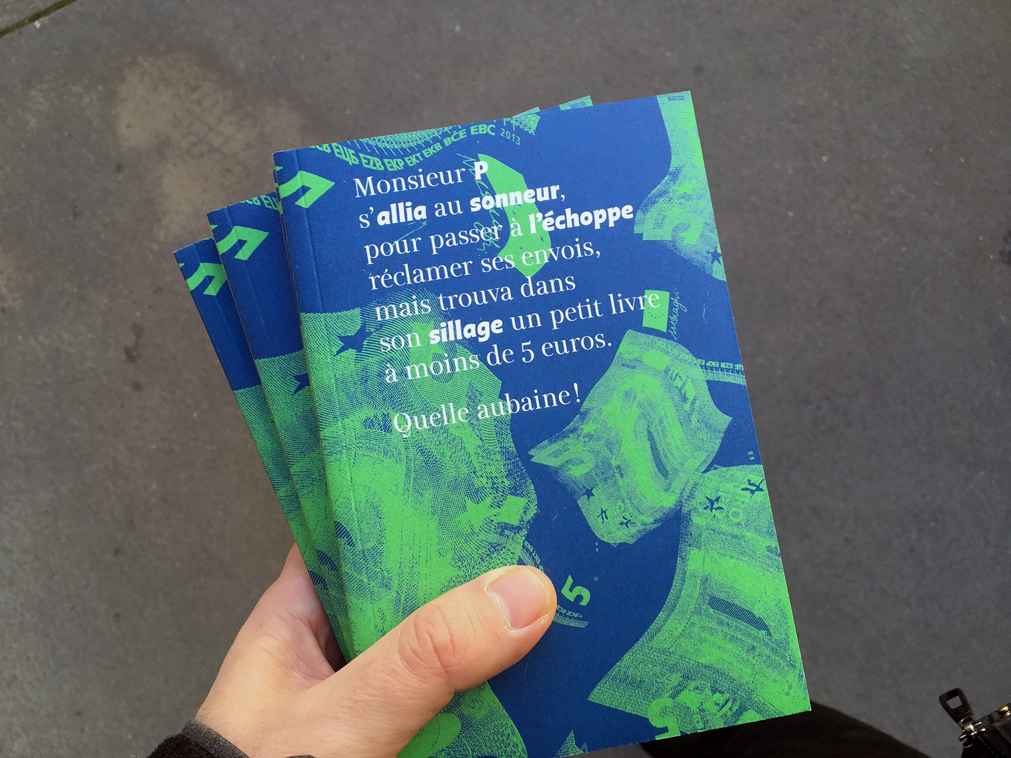
The work was carried out in relation to Salon, an annual publication that lies between a book and a magazine. We wanted to emphasize this in-between by situating us stylistically between two classics, Baskerville, ‘bookish’, and Didot, more connoted to the magazine. Based on a first version for titles (so a display design, and therefore more identity-like), a text version was developed for daily use called Messine Quotidienne. The main difficulty was to stabilize the design of the Titrage version, but without losing the expressive qualities. Then we developed the bold and the italic, which led us to the ‘problem’ of a second voice in typography. What force, what gesture to adopt, what inclination, what relation to the roman? Then we developed versions for larger sizes, currently underway, such as signage or posters, which directed the design towards a sanserif, pictograms, or wood types.
Why teach
Although some results may be welcomed, the question of why can arise. Many are the existing typefaces and many difficulties encountered during their design. First, let’s not forget, an art school is a place of freedom that allows us to search and experiment, freed from the laws of the market. We can see in the learning of type design also a school of the glance, what we learn there is trainer for the eye of every visual artist. But mainly it is to share a motivation that no longer corresponds to the idea that we could have done a few years ago of an obscure and confidential practice. It is no longer uncommon to see a type design workshop in an art school, publications and translations are increasingly available, resources are at hand, online, and digital tools are more in addition varied and accessible. Calligraphy, which I suspected was too archaic a practice, gives not only an excellent understanding to type, but also a real pleasure to make that I see each time in the students.
Nevertheless, type design remains a complex, dense practice.
It requires maturation beyond the scope of a project in an art school. There are many pitfalls such as isolation and compartmentalization — for the student as for the teacher. And, in principle, a font is a tool that is created for use, which means that the student must face two different tasks (type design and typography, even graphic design) and that he must develop two types of special attention, difficult to combine in the same curriculum. One can conclude: the type design is a practice too exclusive.
Yes, it’s not easy. All the more so that to make simple amounts to producing a certain invisibility of the characters that readability requires, but whose degree remains to be defined since at the other end of the spectrum, the expression is just as important. 2 In this fascinating tension, that I see all the interest of a work that never seems to be exhausted, constantly being reformulated. So to conclude, it’s probably because it’s not easy, because it takes time for type design is particularly interesting to study and teach. ‘It’s so simple, that’s why it’s so complicated’, sums up (so well) Paul Rand.
Share, motivations and doubts
The willingness to share education-related issues led to a first international seminar entitled Let’s Type 3 in 2014.
On this basis, the Pangramme project was born two years later 4.
Student creation seems to lack visibility, and only a tiny part is published. This was reason enough for us, immediately confirmed by the many works received. But quickly a question arose: how to exhibit type designs?
How to exhibit
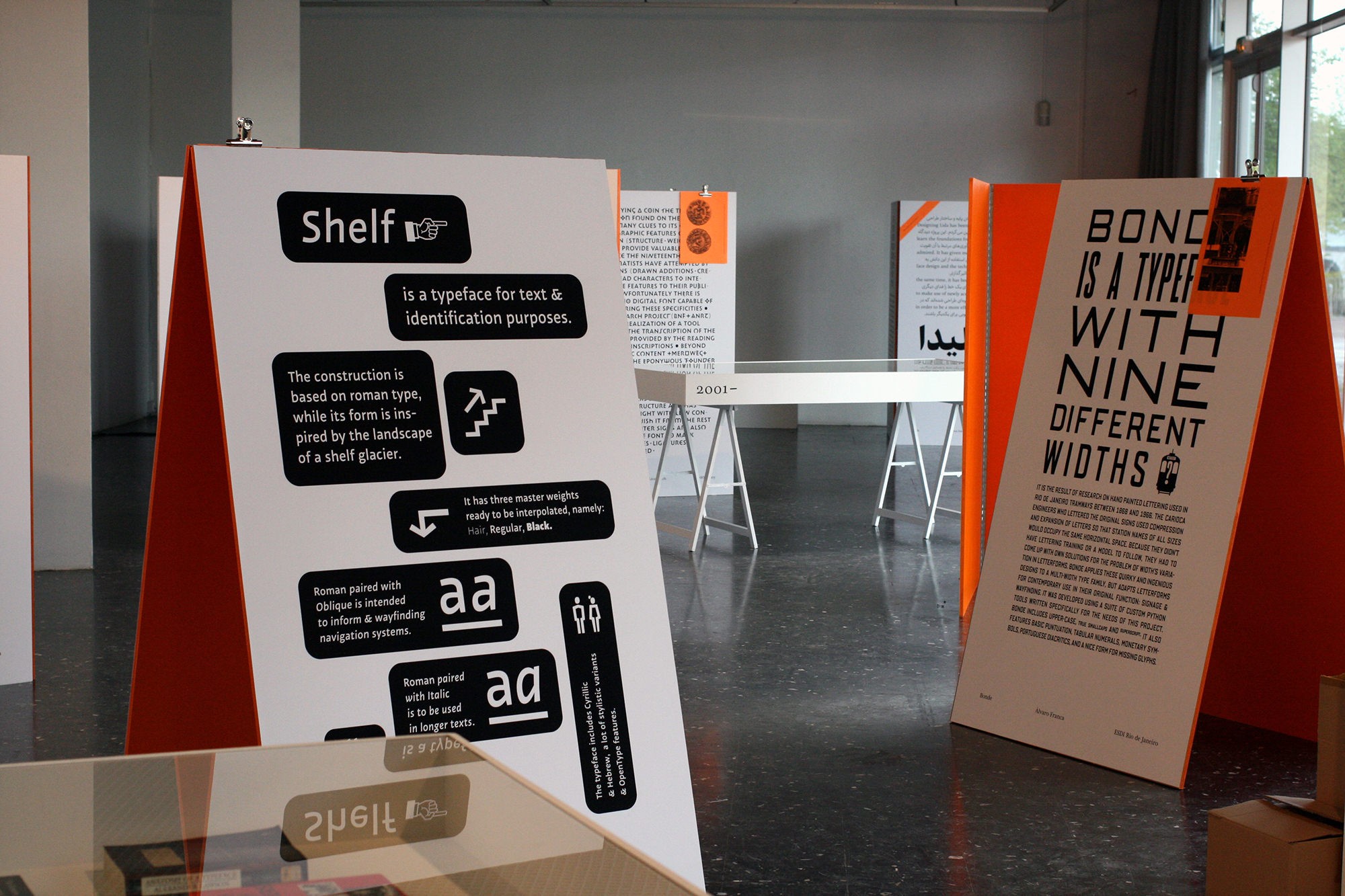
We could have left the presentation concern to the participants. The working files of the call for candidatures on the other hand often lacked care, recurring criticism of the jury, as if so much time had been spent on the drawing of the characters, that one lost the necessary retreat. On the basis of this observation, but especially in order to offer a better overview, it was agreed that the students in charge of graphic design would decide on a common form for the projects. Although there is a certain charm in the decomposition, we agreed that the presentation of characters as a set of glyphs or alphabets are unconvincing. The smallest form in typography is more the word than the letter. 5 The pangrams (like the famous ‘The quick brown fox jumps over the lazy dog’ 6) have the advantage of presenting all the letters of an alphabet, but say nothing about the projects. These are finally unique layouts for each project that have been selected. A short description written by each participant and composed with the respective typeface gives to see and read simultaneously. References are added as footnotes on the panels, which, on a human scale, allow a random walk in the exhibition space.
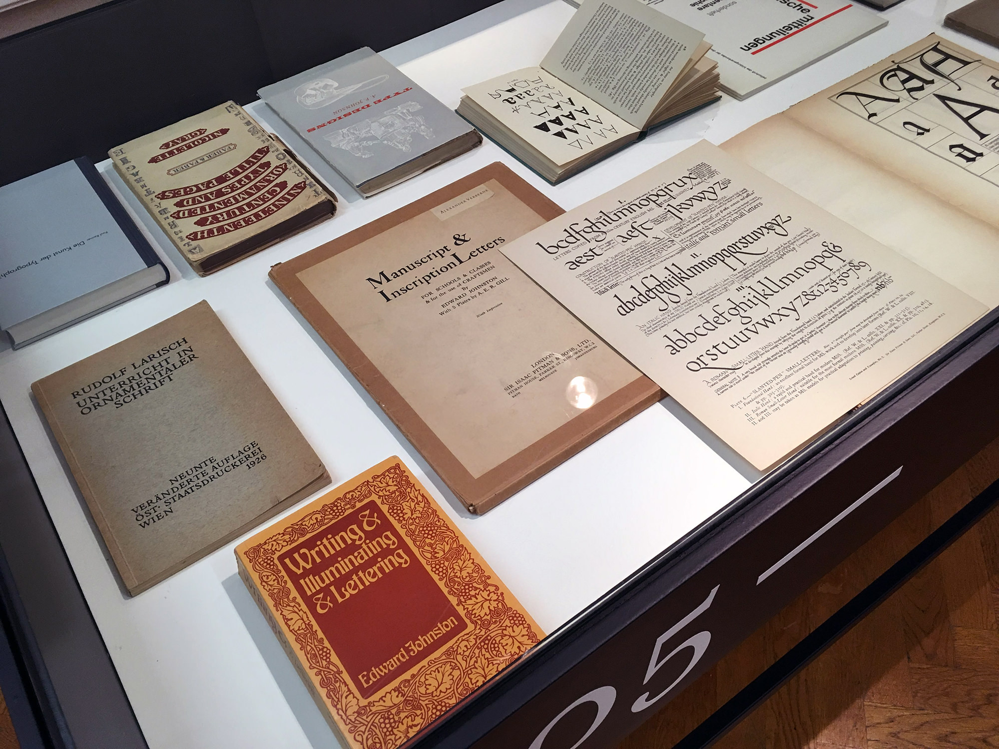
We also wanted to highlight the educational space of the projects, the schools in the sense of currents of thought, by surrounding / accompanying them with a selection of books and manuals published during the twentieth century, starting with the emblematic Unterricht in ornamentaler Schrift of Larisch and Johnston’s Writing & Illuminating & Lettering. They appear as witnesses of their time in the exhibition, without additional information, inviting to discovery. There are many points of view, dogmas and contradictions. We also wanted to include in the exhibition the reference books and designers of the participants, information that we had requested, but which we gave up for lack of finding a relevant form. 7
Finally, the work accomplished, we found that despite its diversity the exhibition could not constitute a complete panorama: the activity seems denser than the selection can say. It was not easy for the jury to decide, the level being fairly homogeneous. Dozens of projects would have deserved to be selected too.
That is why we decided to include in the exhibition, with the agreement of the participants, the complete archive of the call for applications (all the projects sent by the students in their original form) without making any difference between project selected and not selected. In thick binders, everyone could make his own selection, his own panorama.
Jérôme Knebusch (Franco-German, 1978) works mainly on visual identity, book and type design projects, as an author or independently for cultural institutions. Additional practices are research, curating and teaching. He is professor at the École supérieure d'art de Lorraine, Metz (FR) and at the Atelier National de Recherche Typographique, Nancy (FR). He founded and operates Poem.
- All Messine specimens can be downloaded at http://metzentouteslettres.blogspot.com, animated video (French) at https://vimeo.com/296889870», conference (English) at: https://extra.u-picardie.fr/apiu-webtv/watch_video.php?v=2Y25OXH46AGM. ↩
-
- The idea of the transparency of a typeface in favor of receiving the text was developed mainly by Stanley Morison and Beatrice Warde at the beginning of the 20th century, with among others the famous essay ‘The Crystal Goblet’. In the framework of my courses, I like to oppose to this idea, that of Wolfgang Weingart: ‘What is the point of readability if it does not make you want to read?’
- Let’s Type, 20 February 2014, ESAL Metz, with Onur Yazıcıgil, Alejandro Lo Celso, Johannes Bergerhausen, Jérôme Knebusch, Alice Savoie, Thomas Huot-Marchand, Elamine Maecha. Videos at: https://vimeo.com/letstypevideo. ↩
- ‘Pangramme: learning type design’, international student type design exhibition, ESAL Metz, 2016. http://pangramme.org/ ↩
-
- ‘The central paradox of type design is that in an immediate sense we design letterforms, but letterforms are not our product. We are really word-shape designers; it is only in combination that letters become type.’ Matthew Carter, Communicating Graphically, RSA Journal, 1990.
- The nice video somebody made years ago in coincidence with the English pangram is a must: https://bit.ly/30kLMOw ↩
-
- A quick read of their information reveals as favorite books: Tracy, Letters of Credit; Bringhurst, The Elements of Typographic Style; Smeijers, Counterpunch; Unger, While you are reading; Hochuli, Detail in Typography; Noordzij, The Stroke; Kinross, Modern Typography. For designers by priority: Bram De Does, Roger Excoffon, Adrian Frutiger, Unger Gerard, Matthew Carter, Zusana Licko.