Borges is the result of Alejandro Lo Celso’s admiration as reader for the fantastic oeuvre of Jorge Luis Borges. His writing technique, that of a throrough, tireless goldsmith, at endlessly seeking the perfect word, suggested a clean, economical letterform, of certain elegance. This awarded typeface has become a classic from PampaType. And 20 years after its first release, in 2022, the family has been revamped and expanded to include many more features and specials. Read about the ideas behind the design of Borges and its details here.
A multi-style typeface for comfortable reading
Alejandro designed the text versions firstly, and later he felt the need of extending the concept to display fonts. In its anatomy Borges is a classic type that combines dignity and grace from the French Renaissance with a contemporary flavor, not far from Dutch types from the digital era. All this gives Borges a versatility in use as well as comfort in reading.
J. L. Borges. Fantastic story teller
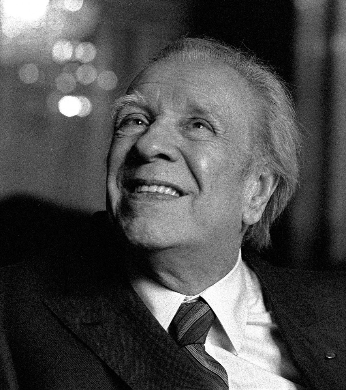
Jorge Luis Borges wrote a notably original oeuvre, which gave water to all literary genres: narrative, poetry, essay, and within the most diverse subjects. There is a Borges resident of the pampas and a lunfardo connoisseur (the argot of Buenos Aires), while there is a mystic Borges, a Nordic mythologies lover, and a surrealist Borges who created 'The Aleph' and pararell universes. There is an Argentinean Borges and a universal Borges; there are two Borges, a youngman and an older both seated at the extremes of the same bench, unwinding a time that is past for the one and future for the other. J.L.Borges honoured human imagination, and gave us an exquisite literary work, rich in ideas and poetic expression.
Qualities
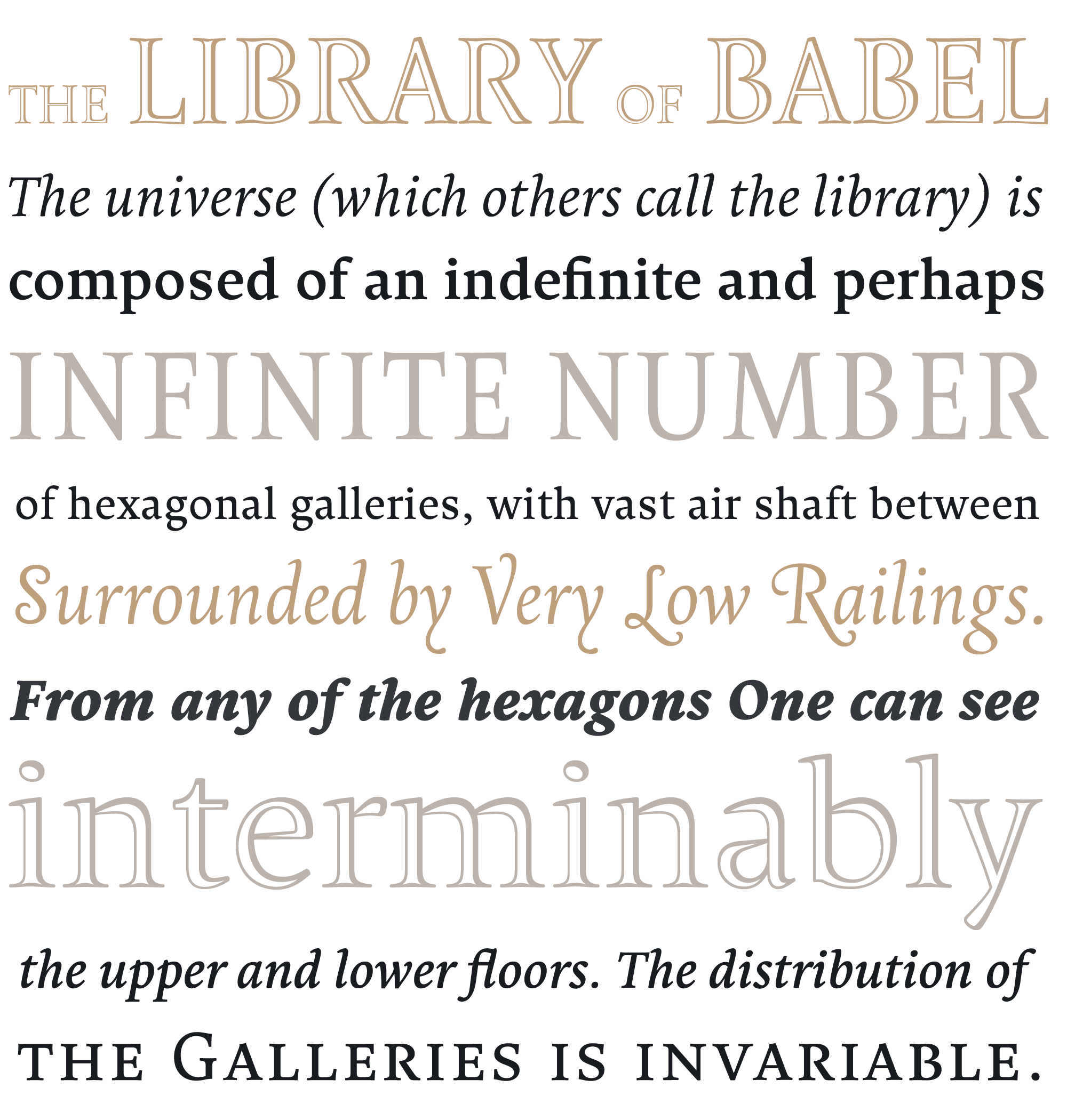
The Borges type family is an attempt at reflecting that state of diversity, controversy, singularity: a type that may express precision, moderation, character, and economy; qualities with which Borges conceived his words; a type that could capture some of the fantastic which was a significant part of his creative world. Borges letterforms are slightly narrow, with a pretty large x-height, and short ascenders and descenders, all of which favours its use within newspapers and other space-saving situations. However Borges gives the text-line a subtle horizontal stress, its forms are round & open which make it more comfortable in reading. Finally, its flowing cursives provide a harmonic contrast with the romans.
Borges, a versatile family
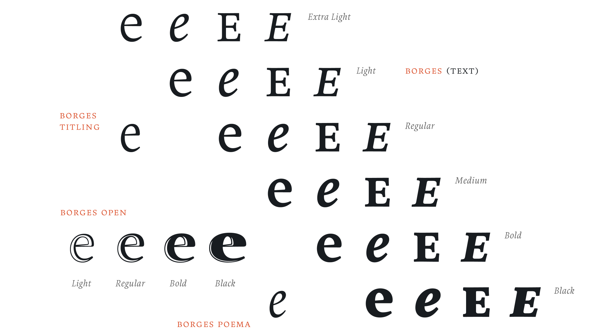
Borges is a multistyle family. Borges [text] includes six complete weights of roman, real cursives and their corresponding smallcaps, offering a good stylistic palette for demanding typography settings. Borges Titling is the titling font companion, slightly more compressed and slender, ideal for persuasive headings with a bookish atmosphere. And there is also a Borges Poema, a spirited, modern chancery aimed at more delicate moments.

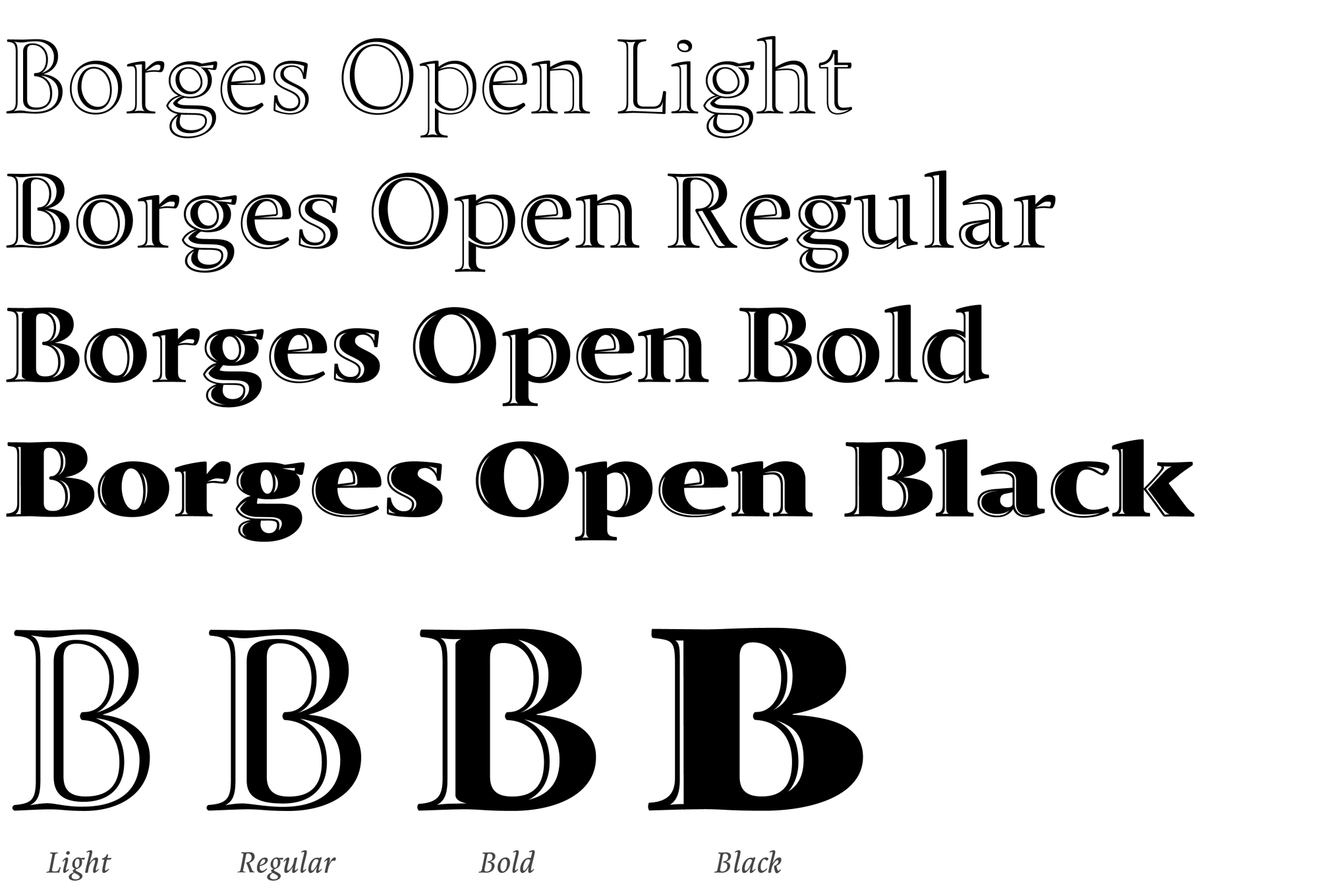
New: Borges Open, for elegant titling
Borges Open, a set of open faces for special occasions, was born in 2025. The four Borges Open styles have been carefully drawn to offer specific impressions in titles, headings, logos and other display settings. The Light version (formerly named “Borges Título Hueca”) is the original style: elegant, balanced, serene. It is ideal for black-tie occasions, and was awarded by Matthew Carter at the Morisawa Awards in Japan. The other three styles were added in 2025. The Regular weight was designed to offer an epigraphic feel, as if it had been carved in stone, balancing light and shadow in equal proportions. The Bold has a larger shadow, giving it more power without being too black or too wide. And the Black style is the strongest choice when you need to combine impact and refinement. See Borges Open in detail.
