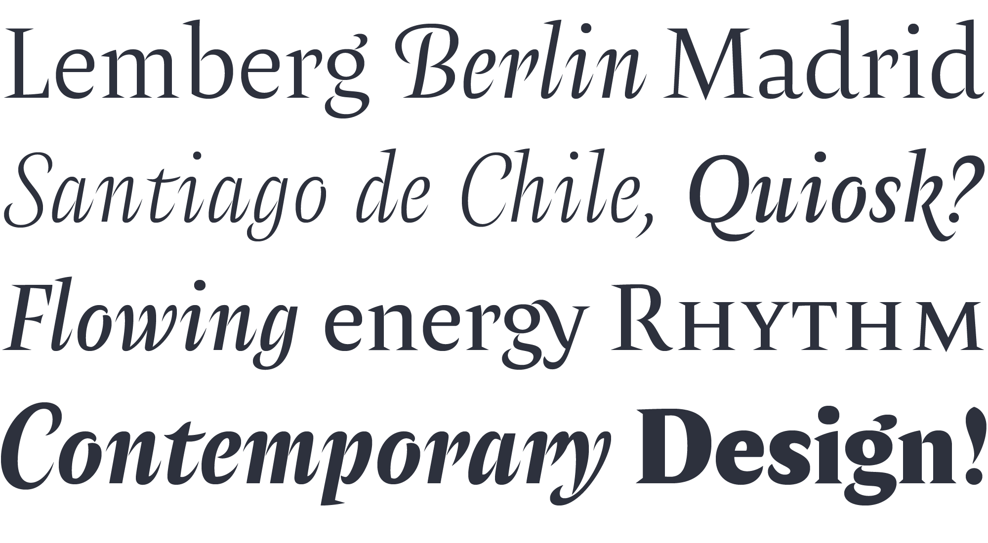
Designed in Chile by Francisco Gálvez with a clear idea on how refinement & austerity can meet harmoniously, the typeface Amster builds a text that combines high readability and charm.
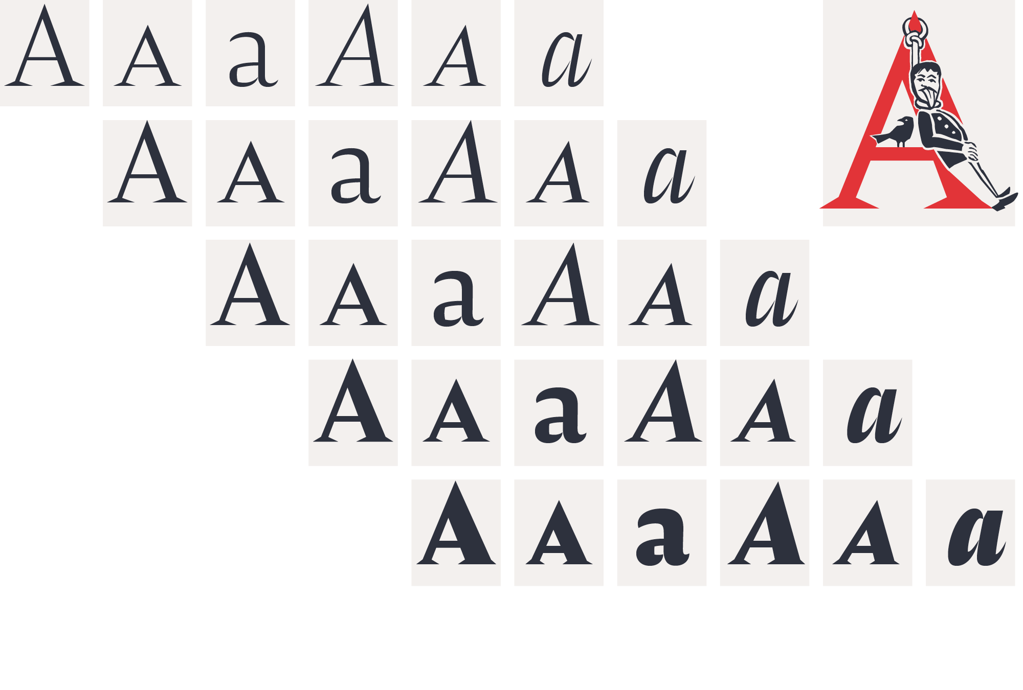
Amster has five weights of roman & cursive fonts, both with smallcaps, all figures and currencies, ornaments, tons of ligatures and all fully equipped with several contextual sorts. Amster is a very versatile type, it allows for the widest range of applications: from screen to print, from small text to display sizes, from science to poetry.
Singular, energetic rhythm
Several characters in Amster stand out for their beauty. Also its even spacing and precise sense of rhythm makes it an outstanding piece of type design. A special kind of energy flows throughout Amster in the form of vigorous shapes & countershapes which give the text an exceptional liveliness that stimulates the reader.
Style: Precise and Friendly
Sharp serifs and frank counterforms give Amster an atmosphere of precision and certainty, while the subtle modulation of strokes creates a polite and friendly text. The design of the cursives takes the sharpness of the romans into a vigorous rhythm, making them ideal companions within the text line.

Inspiration: Mauricio Amster (1907-1980)
Amster pays tribute to Mauricio Amster, a passionate graphic artist who largely contributed to Chilean visual culture in the nineteen fourties and fifties. Born in Lviv (then Poland, today Ukraine), his parents had died at a Nazi camp when he moved to Berlin where he studied graphic arts in Bauhaus times. Then he moved to Spain where he joined the communist party, began cultural activism besides ante-fascist intellectuals such as the Chilean poets Pablo Neruda and Vicente Huidobro. Having worked for the ministry of public instructions & arts, in 1939 he and his wife escaped Franco’s regime to France, and later migrated to Chile with the help of Neruda. After an intense working life in the graphics arts, book design, book edition, writing, and teaching, Amster died in 1980 in Santiago.
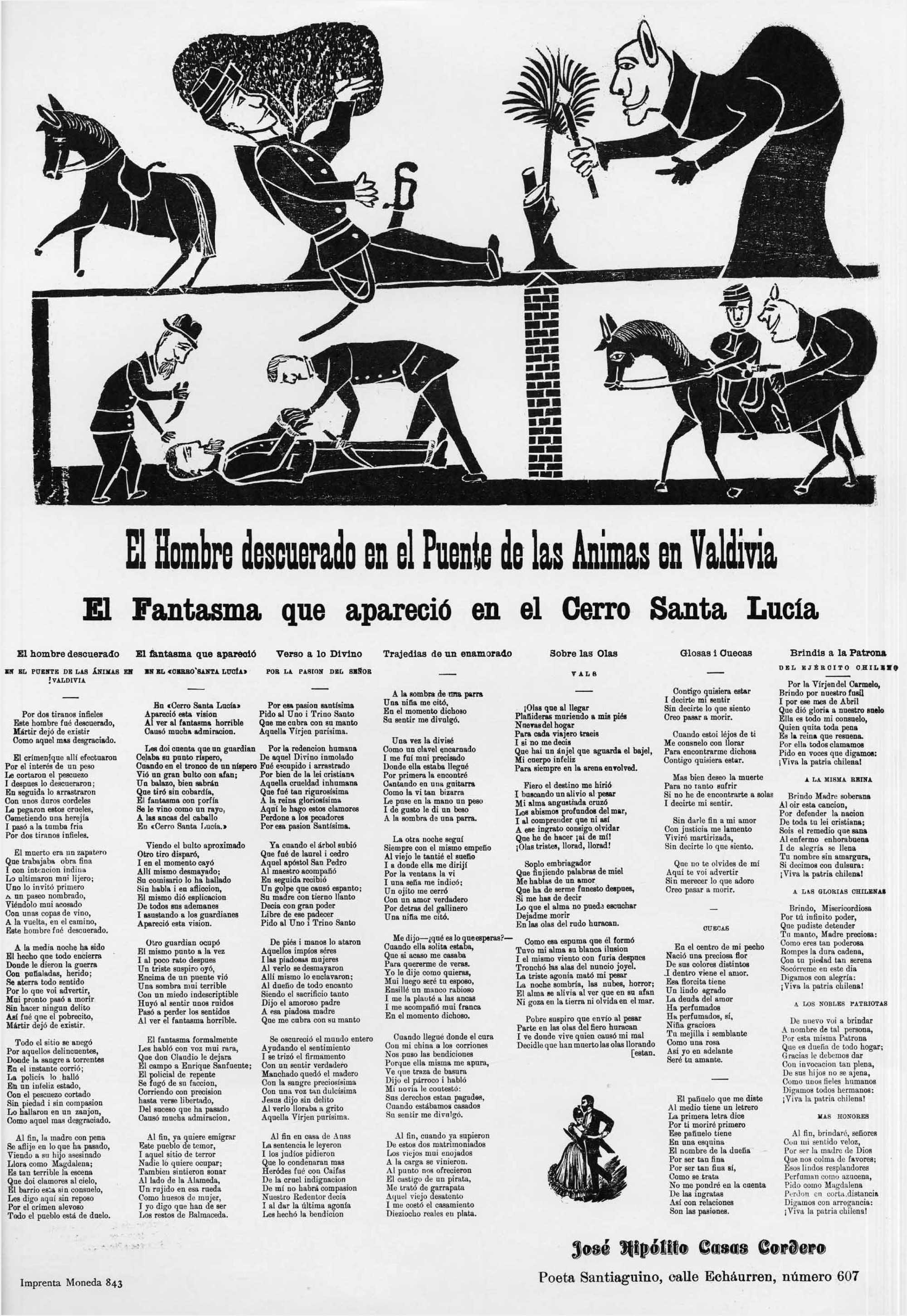
Pliegos de cordel (‘string sheets’)
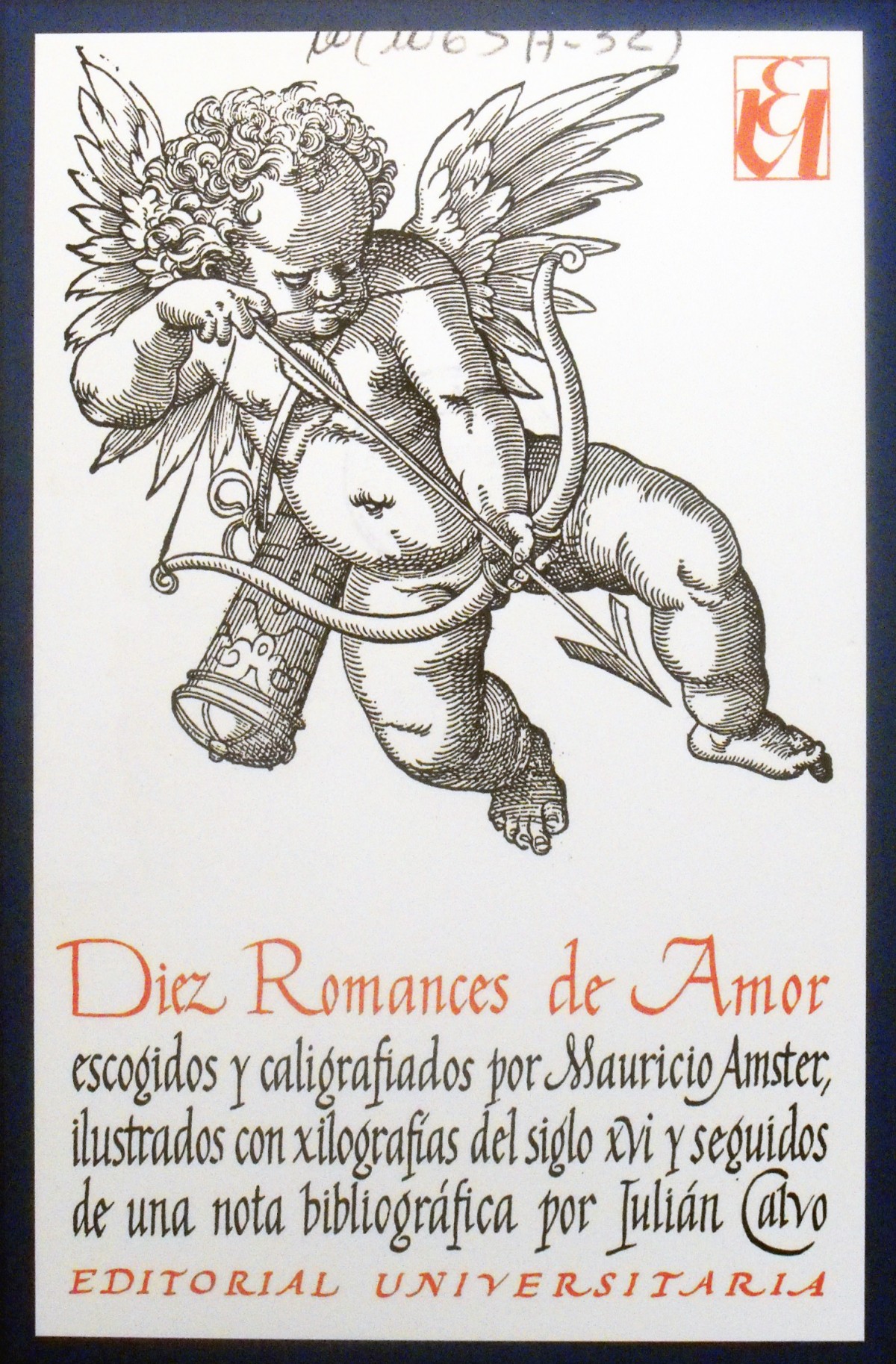
Mauricio Amster designed more than 500 books. A fascimile edition of the Ten Chilean popular engravings deserves our attention. Published in 1973 by the Editorial Universitaria and curated by renown historian Alamiro de Ávila Martel this book tells the story of the pliegos de cordel (as they were displayed in the street hanging from a string tied from tree to tree), also known as the Lira popular. Its text begins like this: España fue siempre un vasto campo de produccion de poesía popular: la larga empresa de la Reconquista frente a los musulmanos produjo una épica culta junto a la cual (…) se acuñaba una poesía popular, cuya última concreción, en ese ámbito épico, fue el Romancero (…). That first capital letter E was designed by Amster for that particular edition, and it was the excuse for Francisco Gálvez to illuminate two whole alphabets of initials.
Amster singular initials
In those loosely printed sheets (Lira popular) that massively circulated in Chile between the late 19 and early 20 century popular poets published their verses. Therefore they reached an unprecedented means to spread their voice, putting the working-class feelings into public scene. Being for some an early expression of the yellow press, always illustrated by engravings often of innocent style, those verses vividly reflected the current facts: robberies, crimes, suicides, political criticism, natural disasters and all kind of wondrous phenomena.
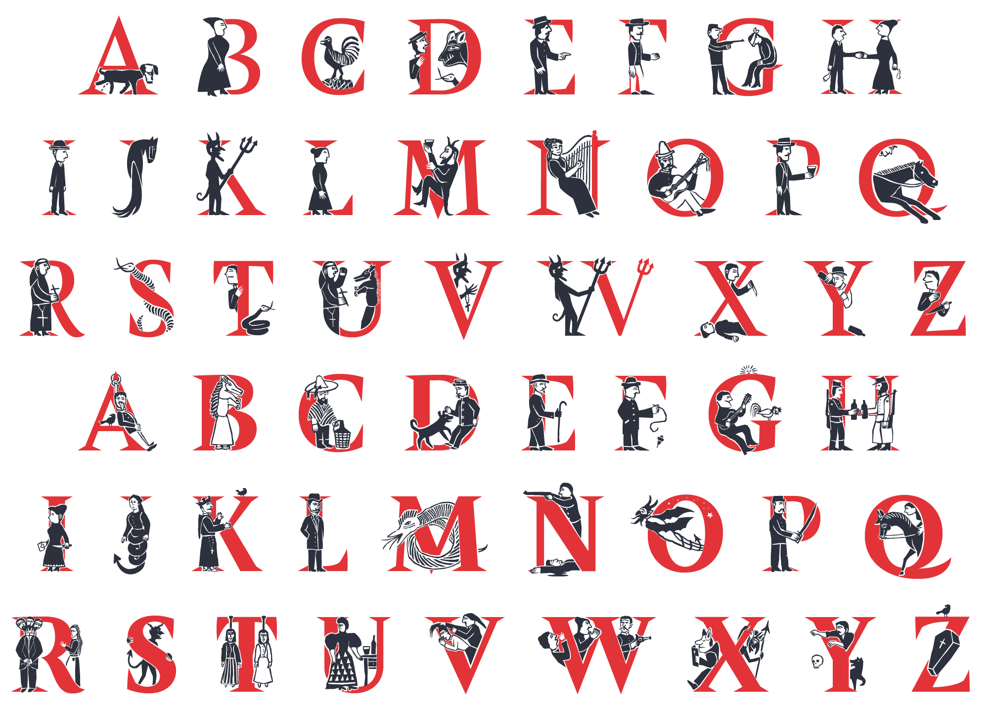
Based on Mauricio Amster’s idea Francisco Gálvez drew two sets of wonderful initials, recapturing the protagonists of those natural and supranatural stories. Farmers & animals, citizens & drunks, criminals & victims, priests & devils, all dance together in this handsomely illuminated bestiary of letters, ideal for fictional or poetic atmospheres. They are all bicolor and can be used as desktop and as webfont too. For more information see our tutorial video just below.