Inspiration: Mauricio Amster (1907-1980)
Often foreigners leave an indeleble trace in cultures which are not proper to them. This has been the case of the Polish-Spanish typographer Mauricio Amster in Chile.
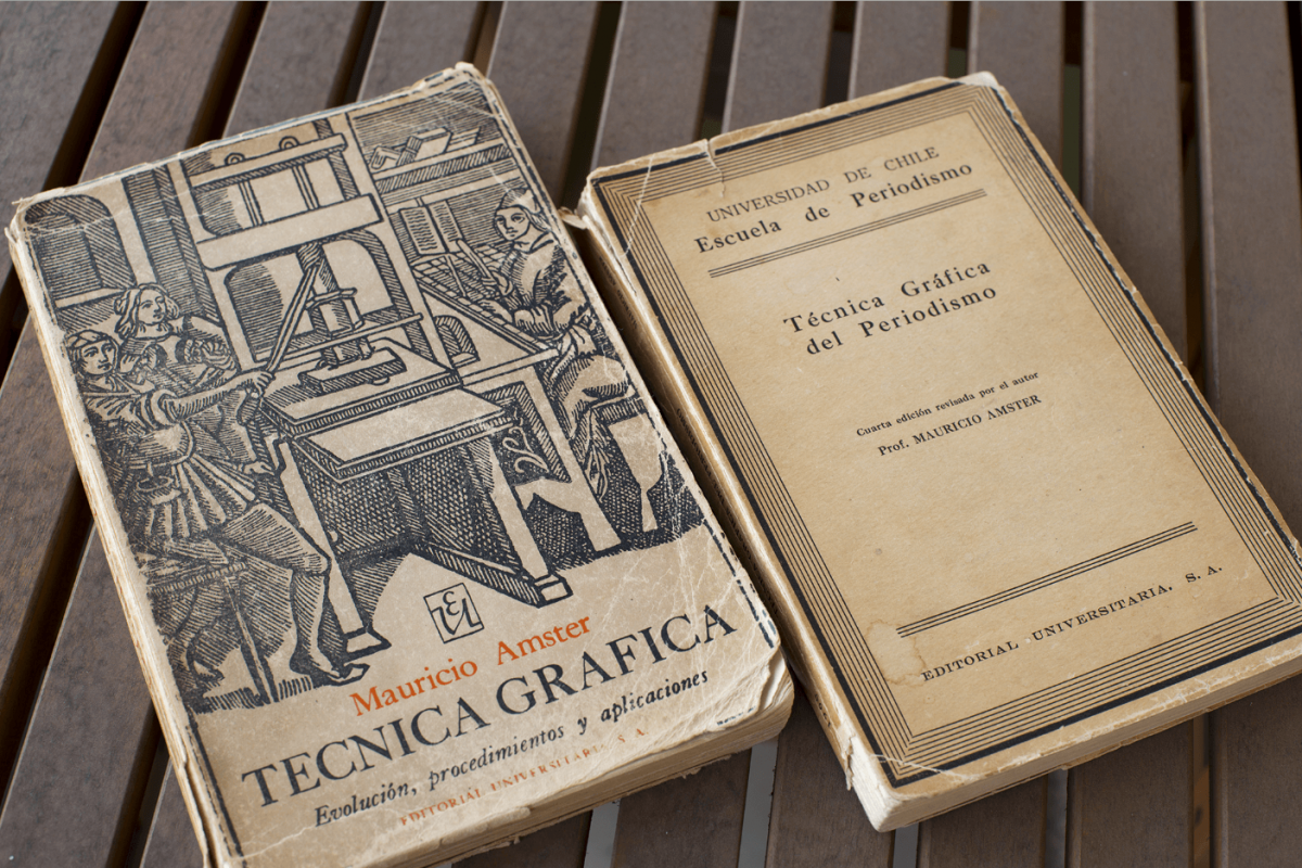
Every self-motivated typeface that I design implies a journey in which I ask myself many questions in regards of the possibilities and subtleties of the typographic dimension of writing. Facing this project in particular, that self-questioning started as a reaction to a Mauricio Amster’s book Técnica Gráfica (1957), aimed at journalism students. Together with Ernesto Montenegro, Amster founded the School of Journalism, Sciences and Techniques of Communication, in the University of Chile in the fifties. He wondered about typography in Chile, a precarious culture by the time.
The honored person behind the type
Dedicating this project to Mauricio Amster was an inevitable thing, and following a suggestion of my friend Eduardo Castillo, I baptised the typeface with the surname of this illustrious person, even though I never met him, I was a kid when he died in 1980.
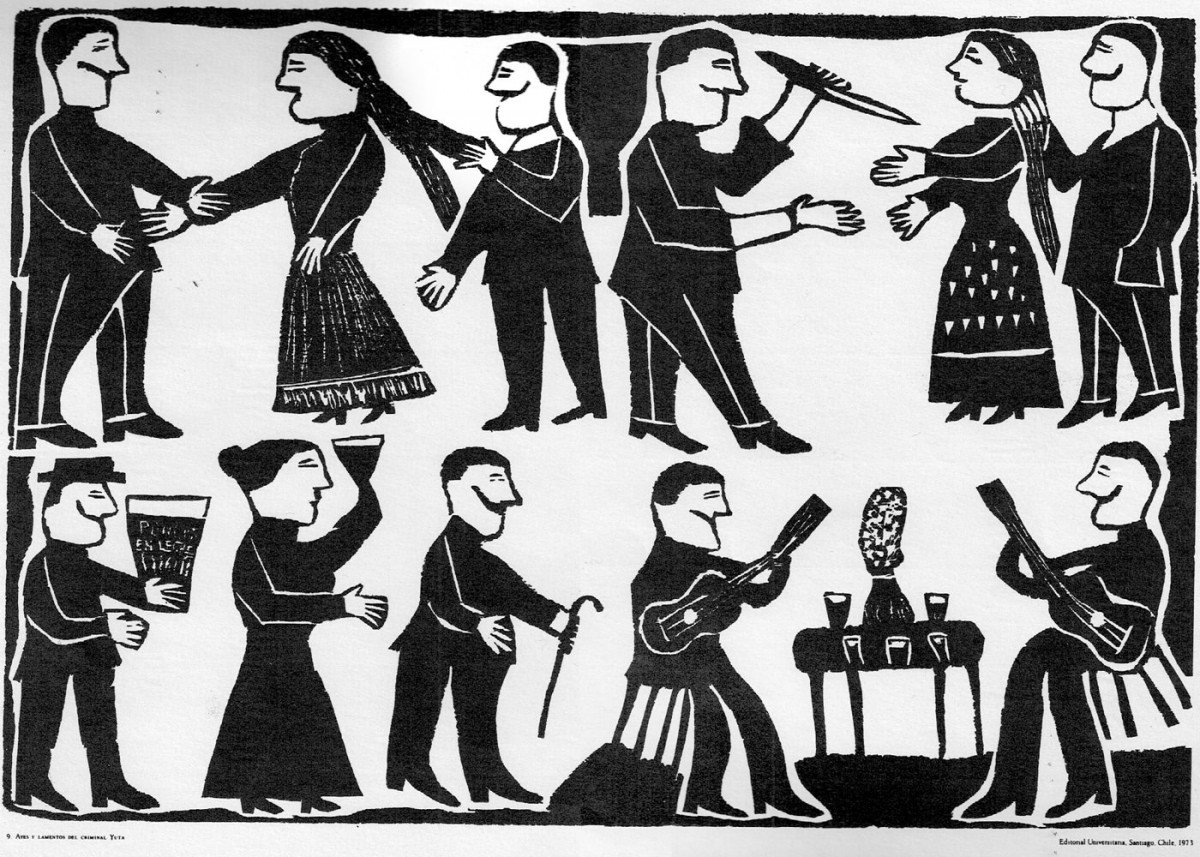
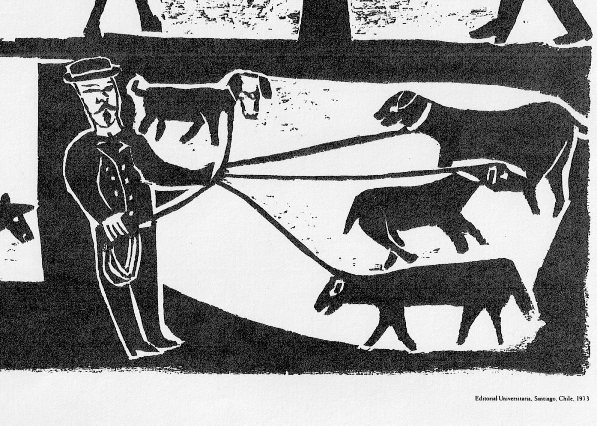
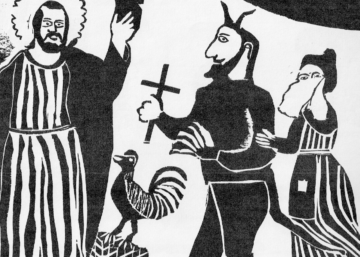
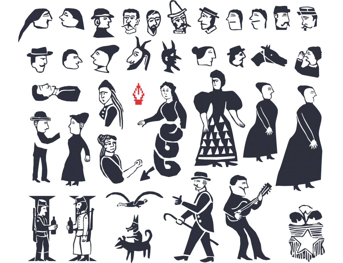
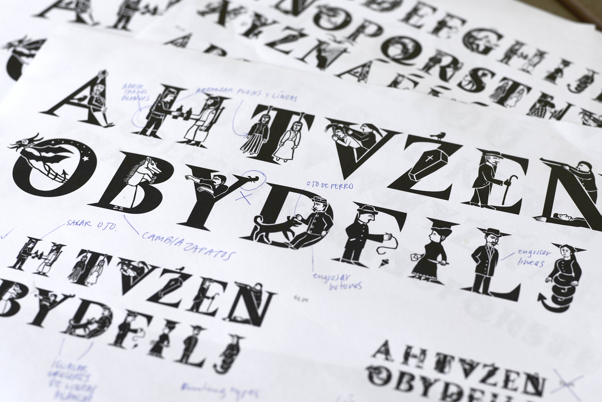
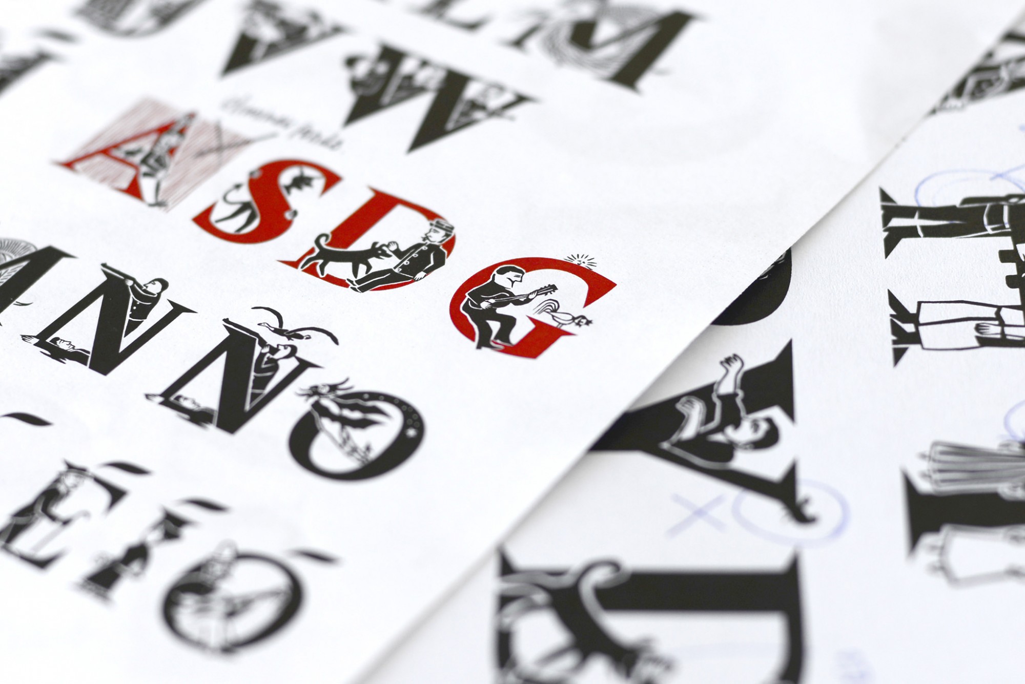
Out of all the different works he made one in particular impressed me a lot. It is a detailed capital letter he designed for an introductory text about a selection of Chilean engravings known as Lira Popular.
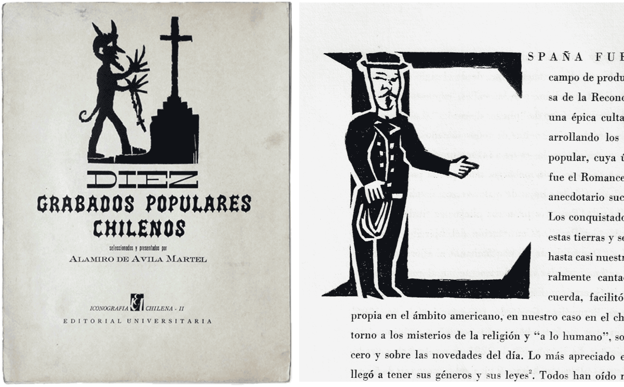
The Lira Popular & its call to tell stories
That work opened my eyes to a literary tradition in Chile which I had ignored, the popular poetry of the Lira usually accompanied with anonymous engravings which related strange and violent stories. The initial letter designed by Mauricio Amster motivated me to create a complete alphabet of initials. Even though probably nobody would actually need such thing, I didn’t think of it as a reason for not doing so.
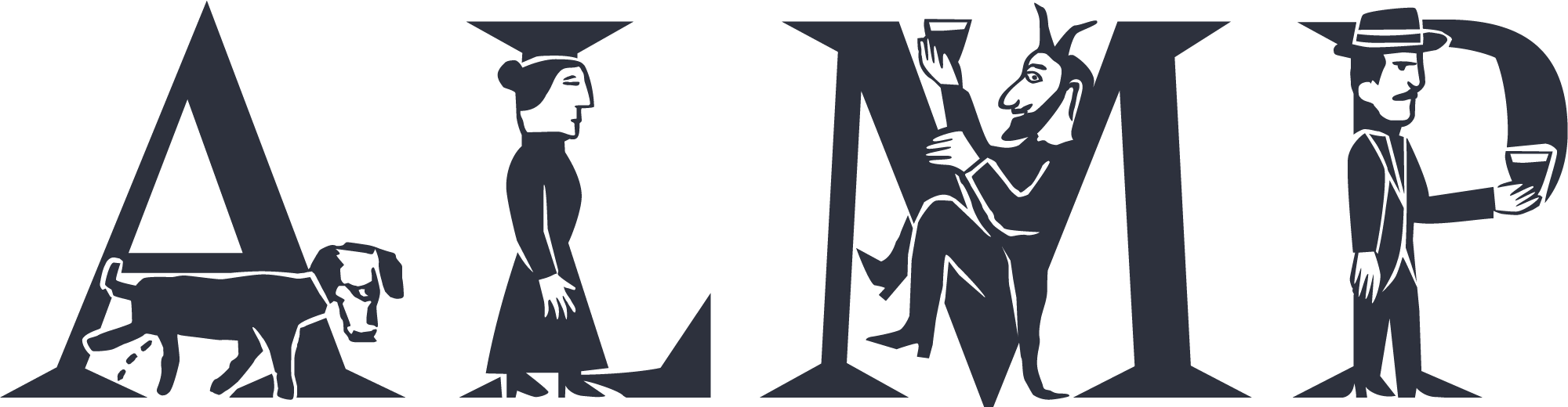
Versales Iluminadas
In the drawing of vectors, to adapt the shapes and proportions of the personages in the engraved scenes of the Lira into the majuscule letters was a whole challenge by itself, a fun and stimulating task. Imagination flies and time is the only enemy to accomplish what ones is looking for.
Amster is an experiment between amateur xylographic printing and the tradition of the book typography. Amateur is a beautiful definition in the sense that one loves the profession without necessarily being professional. Fortunately digital technology now allows for all the possible details that could not be done in the past, almost like a manuscript codex.
The impulse of illuminating the capital letters originated on that idea used in the codex. However illuminations have long lost its power and it’s usually seen as something old or retrograde. Nevertheless this was a motivation to prove otherwise with the illuminated capitals of Amster: that it is possible to tell good stories, to enrich the meaning of texts, and to take advantage of the infinite possibilities that programming offers us. Much remains to be done of course.
Stencil letters for text?
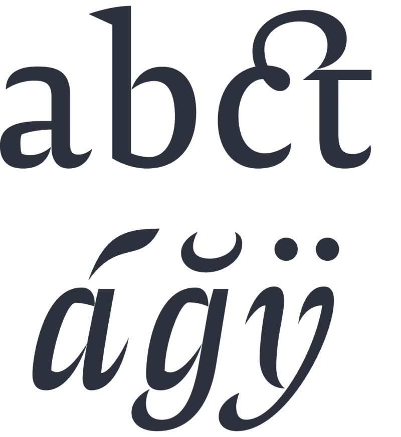
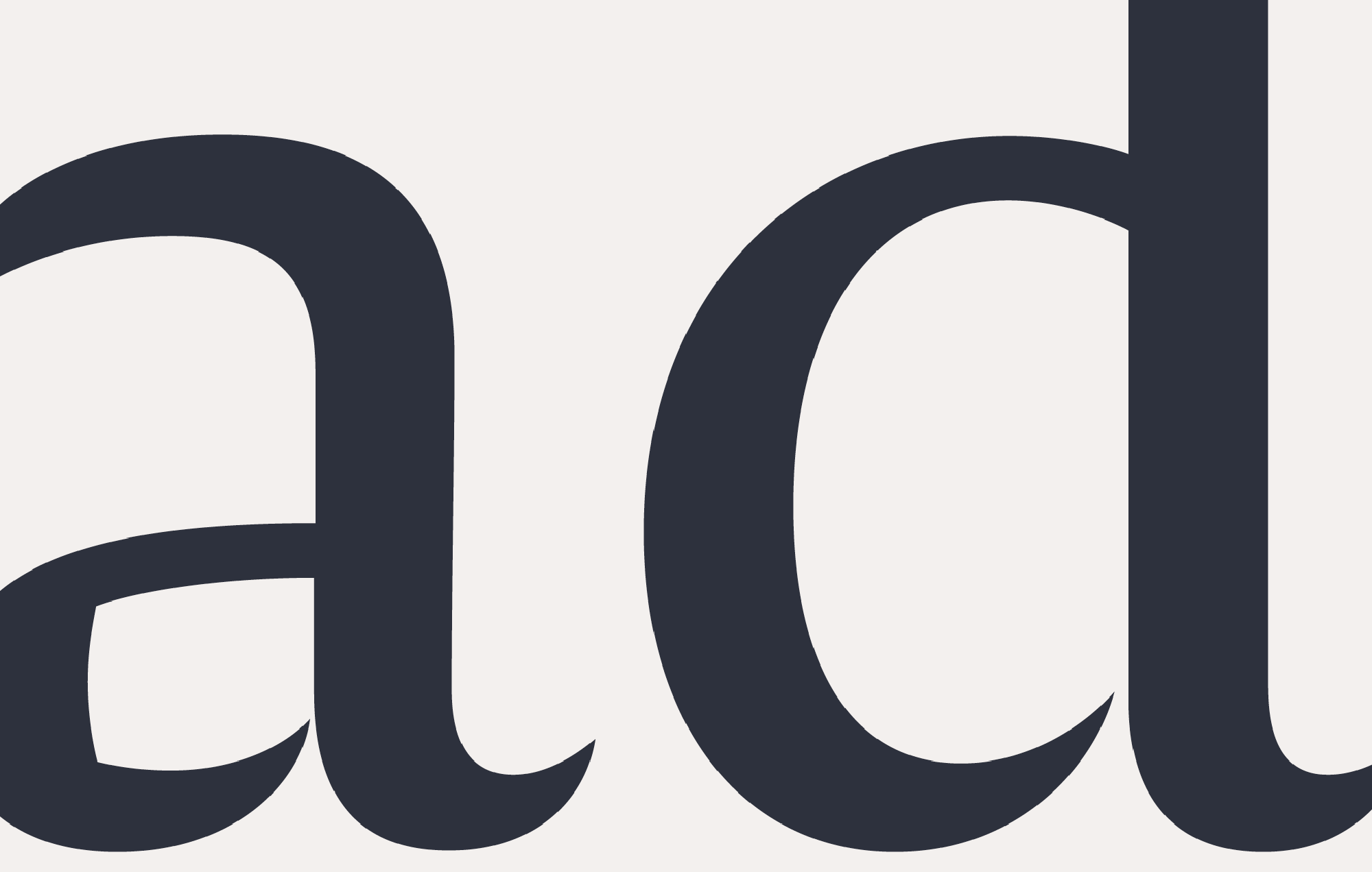
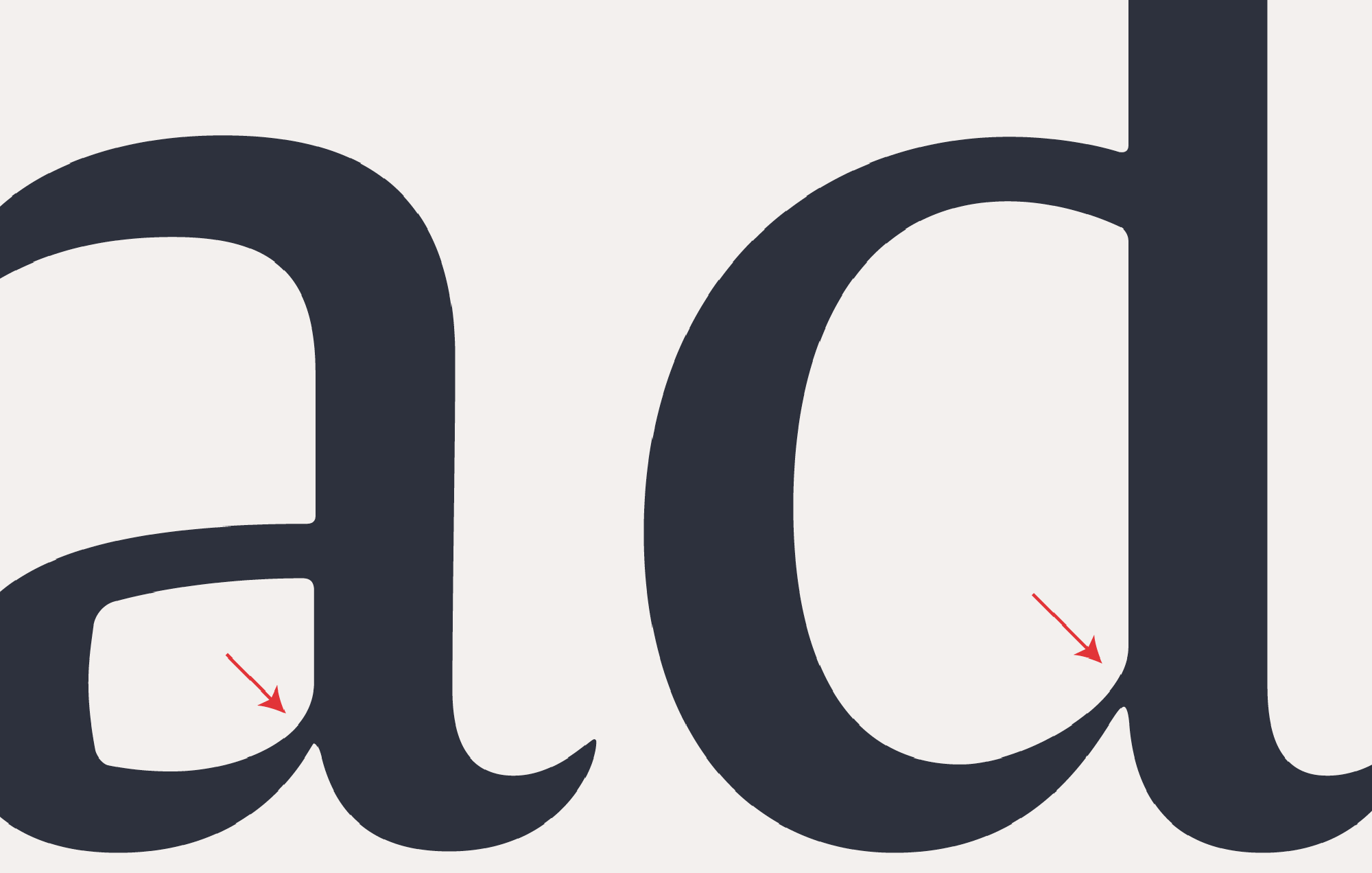
In the text fonts of Amster I also experimented with form. Designing letters not far from the idea of stencil was a consequence of avoiding ink traps, which was longly checked through laser prints. The idea that paper plays a role in the form of letters has always aroused interest. Even today regarding screens something similar happens also with hinting.
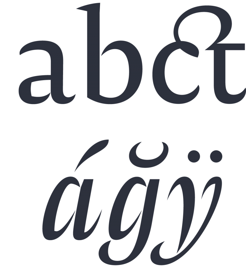
The typeface embolds several design details. To mention a few: there is the caron accent. In a visit to Santiago de Chile, Peter Bil'ak explained to me why the design of this diacritical mark should be different if it’s in a minuscule d or in a t. That explanation made me think of a caron as the right half portion of a complete caron. Even though it resembles the acute accent, its besides d, l, and t makes it clear that it's a different accent.
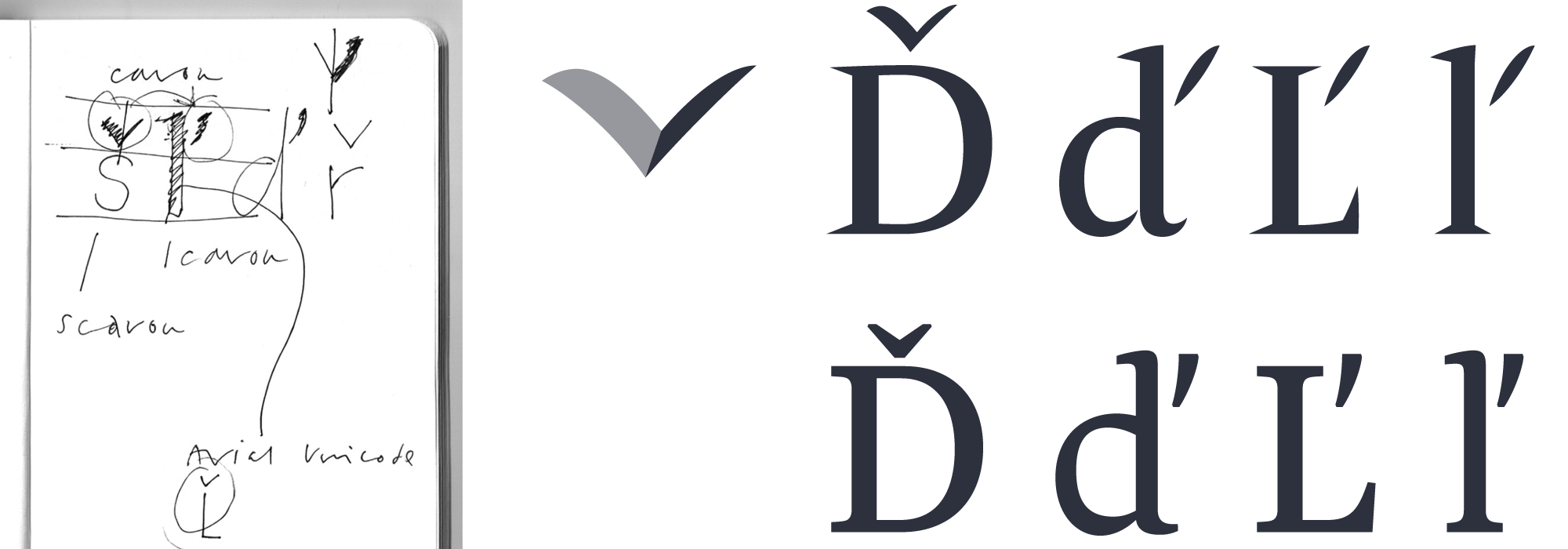
Right: [up] the caron designs in Amster and [down] in Lava by Biľak.
Another detail: Due to a comment by Alejandro Lo Celso, I changed letter Y in the Versales Iluminadas, as the idea was to represent a drunkman and in the initial version the personaje gives the impression of being spying rather than being drunk.

Ornaments of Arabic inspiration
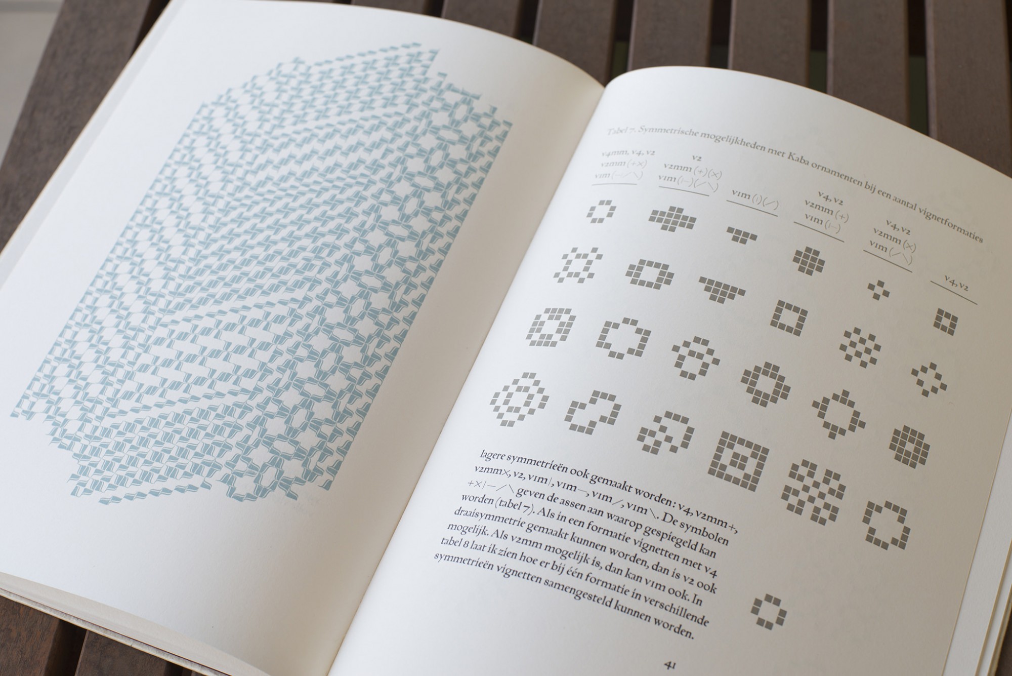
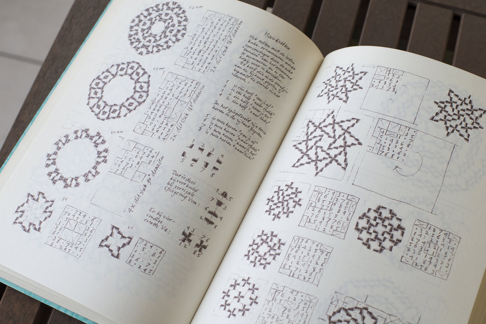
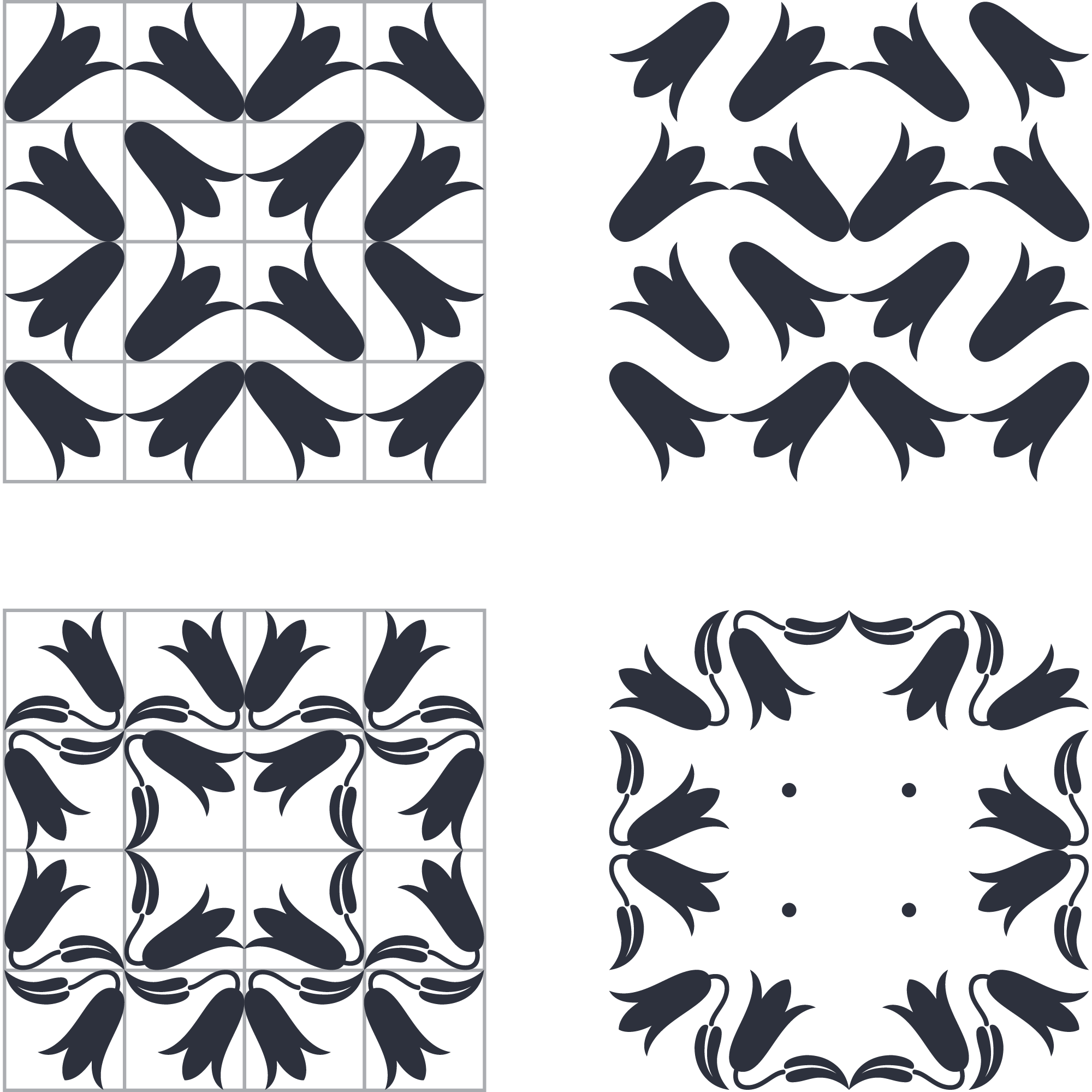
In addition to this, and due to my interest in repetition patterns, I also drew two icons based on the Copihue, the national flower in Chile. They were included in different positions in the character sets of Amster. Many designers know the typefaces made by Bram de Does, but for me it was a discovery to know he had done a powerful work with repetition patterns. I drew inspiration from his two books Kaba Ornaments which are crazy! One is completely drawn by hand, the other made using metal types.
Ending note
The long time involved in designing this family implied refining every detail, not only the strokes assemblies but also the proportions, the falling of curves, the widths and the structure. Redrawing completely the initials was a wonderful exercise in comparing and choosing the best options. The first drawings were too coarse, following the idea of xylographic imprint, however type design always seeks for an overall texture agreeable to the eye, and also to show the subtleties when it is used in big bodies. All these details that also involve elements of the Chilean identity find reason in my gratitude for the anonymous work of Mauricio Amster. Here is the result.